Toward a Heuristic Model for Evaluating the Complexity of Computer Security Visualization Interface
|
|
|
- Homer Neal
- 5 years ago
- Views:
Transcription

1 Georgia State University Georgia State University Computer Science Theses Department of Computer Science Toward a Heuristic Model for Evaluating the Complexity of Computer Security Visualization Interface Hsiu-Chung Wang Follow this and additional works at: Part of the Computer Sciences Commons Recommended Citation Wang, Hsiu-Chung, "Toward a Heuristic Model for Evaluating the Complexity of Computer Security Visualization Interface." Thesis, Georgia State University, This Thesis is brought to you for free and open access by the Department of Computer Science at Georgia State University. It has been accepted for inclusion in Computer Science Theses by an authorized administrator of Georgia State University. For more information, please contact scholarworks@gsu.edu.
2 TOWARD A HEURISTIC MODEL FOR EVALUATING THE COMPLEXITY OF COMPUTER SECURITY VISUALIZATION INTERFACE by HSIU-CHUNG WANG Under the Direction of Ying Zhu ABSTRACT Computer security visualization has gained much attention in the research community in the past few years. However, the advancement in security visualization research has been hampered by the lack of standardization in visualization design, centralized datasets, and evaluation methods. We propose a new heuristic model for evaluating the complexity of computer security visualizations. This complexity evaluation method is designed to evaluate the efficiency of performing visual search in security visualizations in terms of measuring critical memory capacity load needed to perform such tasks. Our method is based on research in cognitive psychology along with characteristics found in a majority of the security visualizations. The main goal for developing this complexity evaluation method is to guide computer security visualization design and compare different visualization designs. Finally, we compare several well known computer security visualization systems. The proposed method has the potential to be extended to other areas of information visualization.
3 INDEX WORDS: Security visualization, Heuristic evaluation, Classification, Evaluation method, Metrics, Cognitive psychology
4 TOWARD A HEURISTIC MODEL FOR EVALUATING THE COMPLEXITY OF COMPUTER SECURITY VISUALIZATION INTERFACE By HSIU-CHUNG WANG A Thesis Submitted in Partial Fulfillment of the Requirements for the Degree of Master of Science in the College of Arts and Sciences Georgia State University 2006
5 Copy Right by Hsiu-Chung Wang 2006
6 TOWARD A HEURISTIC MODEL FOR EVALUATING THE COMPLEXITY OF COMPUTER SECURITY VISUALIZATION INTERFACE By HSIU-CHUNG WANG Major Professor: Ying Zhu Committee: Raj Sunderraman Anu Bourgeois Electronic Version Approved: Office of Graduate Studies College of Arts and Sciences Georgia State University December 2006
7 iv TABLE OF CONTENTS LIST OF TABLES... VI LIST OF FIGURES...VII 1. INTRODUCTION What is Security Visualization? Motivation and Aim Proposed Solution Contribution LITERATURE REVIEW A Classification of the Current Evaluation Methods Current Evaluation Methods Challenges for Evaluating Visual Techniques An Overview of Complexity Evaluation Methods PROPOSED METHODOLOGY Background Workflow in Security Visualization... 65
8 v 3.3. Complexity Evaluation Method CASE STUDY AND ANALYSIS Evaluating NVisionIP Evaluating VisFlowConnect Evaluating RUMINT Discussions CONCLUSION REFERENCES
9 vi LIST OF TABLES Table 1: Attributes that might guide the deployment of attention presented by Wolf Table 2: A proposed evaluation metrics based on three-tier drill down topology, relational complexity theory, and visual search theory designed for recorded information from complexity tree...94 Table 3: The result of applying evaluation metrics to the three complexity tree constructs Table 4: Evaluation results in metrics format for NVisionIP Table 5: Evaluation results in metrics format for VisFlowConnect Table 6: Evaluation results in metrics format for RUMINT Table 7: Evaluation metrics view of each visualization...141
10 vii LIST OF FIGURES Figure 1: Relationships among Visualizations, Evaluation Metrics, and the Complexity Tree...9 Figure 2: Diagram Demonstrating the Classification of Evaluation Methods...14 Figure 3: One of the Approximately 500 Vector Fields Visualized with Each of the Six Visualization Methods Figure 4: Brath s quantitative evaluation metrics. Six different sample visualizations have been evaluated and their evaluation results listed in the metrics...28 Figure 5: Tree map visualization technique as presented by Johnson and Shneiderman Figure 6: File system visualization using information cube visualization presented by Rekimoto...44 Figure 7: Cone tree visualization illustration from Robertson...48 Figure 8: Circle packing visualization for a filing system presented by Wang Figure 9: An example of searching for a target red circle based on a different color by Healey...51 Figure 10: Target-distractor and distractor-distractor differences presented by Wolf Figure 11: Displays illustrate the proximity law of Gestalt Laws by Ware Figure 12: Displays illustrate the similarity law of Gestalt Laws by Ware....58
11 viii Figure 13: Displays illustrate the continuity law of Gestalt Laws by Ware Figure 14: Displays illustrate the symmetry law of Gestalt Laws by Ware...61 Figure 15: Displays illustrate the closure law of Gestalt Laws by Ware Figure 16: Display illustrates the relative size law of Gestalt Laws by Ware Figure 17: Displays illustrate the figure and ground law of Gestalt Laws by Ware Figure 18: A three-tier structure model is presented to illustrate the work flow for visualization activities Figure 19: Workflow of the complexity evaluation method Figure 20: Complexity tree structure diagram...79 Figure 21: A most complex scene from the PortVis visualization system...82 Figure 22: The timeline visualization from PortVis...85 Figure 23: A complexity tree build for timeline visualization from PortVis Figure 24: The evaluated visualization scene and the complexity tree...88 Figure 25: The port visualization scene and its complexity tree...89 Figure 26: Security visualization technique examples for glyphs Figure 27: Security visualization technique examples for histograms Figure 28: Security visualization technique example for parallel coordinate plot from...93 Figure 29: Security visualization technique example for color map from...93
12 ix Figure 30: An example for demonstrate how to calculate the c value...97 Figure 31: An example for demonstrating how to calculate target-distractor size ratio Figure 32: An example for calculating target-distractor orientation ratio Figure 33: High-Level view NVisionIP evaluation result Figure 34: Mid Level view NVisionIP evaluation result Figure 35: Low Level view NVisionIP evaluation results Figure 36: High-level view VisFlowConnect evaluation result Figure 37: Mid-level view VisFlowConnect evaluation result Figure 38: Low-level view VisFlowConnect evaluation result Figure 39: High-level view RUMINT evaluation result Figure 40: Mid-level view RUMINT evaluation result Figure 41: Low-level view RUMINT evaluation result
13 x LIST OF FORMULAS Formula 1: The formula for calculating target-distractor color value. 98 Formula 2: The formula for calculating target-distractor motion ratio. 100 Formula 3: The formula for calculating target-distractor size ratio. 102 Formula 4: The formula for calculating target-distractor orientation ratio. 105
14 1 1. Introduction Information visualization is a process of transforming abstract information into visual form so that users can visualize and interact with the datasets. Throughout the past two decades, many tools, applications, and techniques for information visualization have been developed and published. Computer security visualization is a sub-field of information visualization. Computer security visualization is a comparatively new field. Researchers in the field have searched for ways to allow users to monitor and protect computer systems from malicious attacks, often through the network. Like any other research area, security visualization began with active research into the development of new technologies and techniques. Examples of well known security visualization developments include: NVisionIP from UIUC's SIFT [1], PortVis from UC Davis [2], etc. However, a fundamental problem in information visualization research is how to evaluate different visualization designs in terms of effectiveness and usability. And recently the information visualization research community has begun to put more emphasis on the evaluation of the developed techniques and their performance issues. George Robertson first drew attention to the importance of evaluation in the field of visualization in After nearly a
15 2 decade, the field is still immature. In particular, no evaluation method has been developed specifically for computer security visualization. Some popular evaluation methods are user studies, usability inspections, and quantitative metrics evaluation. These methods mainly evaluate the usability aspects of the visualization technique, namely learnability, efficiency, memorability, errors, and satisfaction. These evaluation methods have their limitations such as: dependence upon expert knowledge, lack of standardization, lack of evaluation methodology, and lack of empirical background research. The majority of visualization designs are based on the assumption that, because of the powerful human visual cognitive capability, visualization helps people quickly understand and process huge amounts of data. However, this assumption is challenged by some recent studies in Human Computer Interaction which show that the effectiveness of visualization depends on both visualization design and domain specific tasks. Therefore it seems that a domain specific evaluation method would be more useful than a generic one. We propose a new evaluation method to measure the complexity of computer security visualization interface. The main difference between our method and previous methods is that we focus on complexity instead of the typical usability parameters such as error and time. We believe the complexity of an interface is an important factor that affects usability. The question we are
16 3 trying to answer is why an interface is more usable than another, not whether it is more usable. Besides, our method is a domain specific evaluation method. Our complexity evaluation method is an objective and quantitative evaluation method grounded in cognitive science, particularly the Gestalt theory and Relational Complexity Theory. Although our initial research focuses on security visualization, the results can potentially be extended to other fields of information visualization. The rest of the paper is organized as follows: The first chapter introduces the problem domain, the solution domain, and the proposed method. The second chapter presents a detailed literature review, including solution domain classification, detailed method descriptions, and problems in the current solution domain. The proposed methodology itself, along with the underlying topics of Gestalt theory, complexity theory, workflow in security visualization, and, most importantly, the detailed process of building complexity trees and quantitative evaluation metrics, is discussed in the third chapter. The fourth chapter presents complexity evaluation results on known security visualization application and techniques. This chapter also does a comparison between other evaluated results and the complexity evaluation results, and discusses disadvantages and advantages of the proposed method. The paper concludes with the fifth chapter, which talks about what is next for the proposed methodology.
17 What is Security Visualization? The majority of security visualization is focused on visualizing network security; in particular, visualizing network traffic log files. The visualization of log files enables users to monitor the network, detect anomalies, find intrusions, assess attacks, sound alarms, and analyze patterns. There have been several techniques developed in recent decades, including glyphs [3], color maps [2], parallel coordinate plots [4], histograms [5], and scatter plots [6]. The existing techniques focuses on visualizing log files that contain recognizable patterns (e.g., port scanning). Therefore, the main task for users is pattern recognition. Pattern recognition means that, by observing the visualization, different representations can be categorized into different patterns (based on proximity, similarity, color, etc), and each pattern means different things, such as an attack, or normal traffic. A user can scan through the visualization quickly to detect patterns that suggest problems in network traffic. The process for finding patterns can generally be broken down into three semantic levels: high-level overview, mid-level view, and low-level detail view. The high-level overview shows the entire dataset at low resolution, allowing users to have a broad understanding of the whole dataset, and to zoom into certain areas that have suspicious network traffic. The mid-level view shows all ports at one point in time, allowing users to understand the relationships between
18 5 different ports. To inspect an individual port s overall metrics throughout the entire time range of the dataset, the low-level view is used. At this level, the user can clearly determine attack patterns. Pattern recognition processes can be categorized into two types: signature-based pattern recognition and non-signature-based pattern recognition. Signature-based pattern recognition can be also seen as a top-down guidance visual search. In top-down searches, the observer has a particular pattern in mind and is trying to match the defined pattern within a search space. In contrast, non-signature-based pattern recognition can be seen as a bottom-up visual search in which the observer attempts to detect some form of pattern within the search space. In computer security visualization, the non-signature based pattern recognition is mainly used for anomaly detection. More and more applications have been developed for security visualization. The active leading research groups include University of Illinois at Urbana-Champaign ( Virginia Tech ( Utah State University ( Georgia Institute of Technology ( and University of Maryland at Baltimore County ( [7].
19 Motivation and Aim George Robertson, the inventor of a well-known information visualization technique (Cone Trees), drew the attention to the importance of evaluation for information visualization in his keynote speech at the IEEE Information Visualization Symposium in Since then, more people have undertaken research in this area; some focusing on extensive usability evaluation with high level design goals and end users [8], and others focusing on standardized low level tasks evaluation [9]. There is no evaluation method developed specifically for security visualization. Instead, the literature applies information visualization evaluation methods to security visualization. Among all of the evaluation methods, user study is the most popular, due to its simplicity in execution and quick response from end users. Other evaluation methods are rarely used in security visualization. Most of the current evaluations focus on three parameters: efficiency (time), error, and user satisfaction. Besides, visualization evaluation suffers from subjective and application-dependent reviews. The main problem with subjectivity and application dependency is that it is hard to compare different visualization applications and techniques, and it makes it difficult for practitioners to decide which technique to choose. It is important to develop objective evaluation methods and work toward the goal of standardization in evaluation methods.
20 7 The main motivation for this research is to develop a method to evaluate complexity rather than the traditional usability parameters: time, error, and satisfaction. The other motivation is to develop an objective evaluation method that can be used to compare different visualization designs. There has been little development in objective and quantitative evaluation methods. We hope the development of this complexity evaluation method can serve as a stepping stone for future objective and quantitative evaluation research. The complexity evaluation method is based on the analysis of psychological workflow needed for processing visual information in a computer security problem solving environment, and therefore is the result of a multidisciplinary study of the relationship between cognitive science and visualization. Last but not least, we hope to develop a method that can help study the utility of visualization in computer security problem solving. Therefore our method will be used to compare the visualization interfaces with traditional text-based interfaces. For example, the development of our complexity evaluation method can explain why reading log files is much slower than trying to analyze the visualization Proposed Solution The proposed complexity evaluation method is an objective and quantitative evaluation method based on cognitive science; in particular, Gestalt theory and relational complexity theory. The evaluation method can be broken down into three parts: constructing the
21 8 complexity tree, analyzing the intricacy of the building blocks of the visualization, and furnishing evaluation criteria based on the complexity tree. Building a complexity tree is an attempt to model the cognitive process (e.g., segmentation, grouping, chunking) in security visualization problem solving. It is constructed to determine how much visual information must be gathered to answer specific questions or form hypotheses [10]. To build a complexity tree, the user decomposes the visualization interface into smaller visual elements based on the Gestalt Theory until one is left with the primitive building blocks for visual cognition. Then the complexity analysis can be applied to these building blocks. In this research, the analysis of the basic visual elements is based on image processing method. After the construction and analysis of the complexity tree, the user can complexity metric can be calculated based on the complexity tree. Each complexity tree is developed for a specific visualization design (Figure 1). A challenge in this research is to come up with quantitative metrics, where the evaluation is tied to a low level visual mapping between a visual entity and a data entity. To deal with this problem, we use the Model-View-Controller (MVC) pattern in developing the complexity evaluation method.

22 9 Figure 1: Relationships among Visualizations, Evaluation Metrics, and the Complexity Tree. The MVC paradigm is a way of separating data, different presentation methods, and manipulations of the data. In the complexity evaluation method, we use this pattern to separate the core data (the complexity tree) from the different evaluation metrics views, and from the process of changing the visualization. Since the evaluation metrics results are based on complexity trees, we can easily convert different visualization complexity trees into our own evaluation metrics and compare them Contribution In this thesis, we analyze the current evaluation methods for information visualization and propose a classification helps to categorize evaluation methods based on fundamental
23 10 attributes. Most importantly, we present a novel evaluation method that measures the complexity of the visualization design in the context of computer security visualization. By applying theories in cognitive science to information visualization evaluation, we try to investigate why visualization is more usable than text-based interface, and also why one visualization design is more usable than another design. It should be noted that complexity is only one of the many factors that affects the usability and effectiveness of information visualization. Therefore our research is a small but significant step towards a comprehensive understanding of the information visualization design space.
24 11 2. Literature Review The research into security visualization has gotten more mature in the past decade. There are several techniques and applications developed for security visualization; however, despite the improvement and success in the development of security visualization, people pay little attention to security visualization evaluations. There has been no special evaluation methods developed for security visualization. Instead, the literature tends to borrow evaluation methods from HCI and visualization literature. Popular evaluation methods for security visualization include user studies [11-22], usability inspections [9, 23-28], and quantitative evaluation metrics [29, 30]. Evaluation is important in visualization research. It is not just a tool to measure how good techniques and applications are, but it also has many benefits: Verifying research hypotheses. Development in techniques and applications is inspired by some unverified theories. It is important to verify and validate these theories. This is a basic research need. Often this is achieved by user studies. For example, development for tree maps is encouraged by the fact that it can help users to achieve faster data search performance compared to normal hierarchical data structures. To evaluate this hypothesis, evaluators can record data searching times
25 12 needed by several testers using both tree maps and hierarchical data structures, and can compare the time results. Encouraging research and challenging researchers in a particular area. An evaluation can be conducted in three stages design time, implementation time, and post-implementation time for evolving techniques and applications development. Evaluation performed at different stages can help researchers to achieve better results, while challenging them to do better in the development process. At design time, evaluation can help to uncover things not being considered and to verify the feasibility of the research before resources get wasted. Evaluation at implementation time can help to correct mistakes. Once the implementation is complete, evaluation gives credibility to the research. Increasing communication among academics, industry, and government. Often the education research results go unappreciated or are shared with only a select few. This is caused by the research not being easy to understand and has no credibility. The evaluation can help research establish value and demonstrate its improvement over legacy methods. The evaluation can also demonstrate the practical usability of the research. Once credibility is shown and practical usage is demonstrated, capable groups in industry and government will be more than happy to adopt new research
26 13 results. Evaluation of techniques and applications can be viewed as a means of communication to convince capable groups to use them. Comparing technical approaches. The most basic need for evaluation is to identify which approaches work best in what contexts. There are many techniques developed for improving one common goal (e.g., faster identification performance), but it is often hard to determine which approach is best. Any type of evaluation method can serve this purpose, but the use of a universal quantitative comparison method is suggested for comparing a large number of different techniques. Determine if program goals have been achieved. Research projects have goals that need to be achieved. It is important for research projects to show progress and maintain a confidence level in accomplishing goals. Thus, an evaluation method can help measure success in completing goals and demonstrate encouraging progress during the development phase.

27 A Classification of the Current Evaluation Methods Figure 2: Diagram Demonstrating the Classification of Evaluation Methods. After surveying the visualization evaluation literature, we created a novel classification space for visualization evaluation. The classification provides vocabularies to describe evaluation methods and displays relationships between different evaluation methods. The classification categorizes evaluation methods through three key characteristics: context of evaluation, point of view, and type of results. The classification structure is presented in Figure 2.
28 15 The first characteristic used to discriminate different evaluation methods is context of evaluation. Context of evaluation categorizes evaluation methods into two levels. The high-level methods perform evaluation at the system level, and low-level methods perform evaluation at the component level. At the system level, the goals, capable tasks, and hypotheses of a technique are verified. Typically, the speed, accuracy, and limitations in performing a task are recorded. The evaluation criteria for high-level methods are extremely application-dependent. User study is a popular method belonging to this category. At the component level, interaction techniques, visual representation mapping, and overall designs are considered. Evaluations belonging to this category have application-independent evaluation criteria. A popular format to evaluate the interaction of techniques is to follow the interaction tasks set described by Zhou and Feiner [31]. Usability inspection is a popular method belonging to the low-level category. In general, the main difference between high-level and low-level characteristics is that the high-level approach is application-dependent, whereas the low-level approach is application-independent. The second key characteristic used to differentiate evaluation methods is point of view. The point of view expresses how well an evaluation method represents views fairly and without bias. It categorizes evaluation methods into two groups, subjective and objective evaluation reviews. Typically, an evaluation method is subjective when it conducts user surveys or expert reviews. The user surveys ask end users to try out the developed techniques or applications and
29 16 record their response. The expert reviews ask field experts to go through the techniques or applications and record suggestions for improvement. In any format, evaluation methods belonging to this category record opinions as evaluation results. Usually there are no standards or regulations about how to record user response. An evaluation method that belongs to the objective point of view analyzes what is present in the visualization. The objective review records statistics about the visualization and related data that have universal meaning. An example is recording how many points a visualization uses, and what the data density of the visualization is. The third key characteristic used to describe differences in evaluation methods is type of result. This characteristic is defined by what gets recorded in the evaluation process. It categorizes evaluation methods into two groups, qualitative results and quantitative results. Quantitative results refer to numeric recordings. Any other recording format belongs to qualitative results, including verbal expressions, video recordings, and sound recordings. Qualitative results cannot usually be easily compared. Some evaluation formats, like the user study, can have both quantitative and qualitative evaluation results. When doing categorization using the proposed classification, we categorize evaluation methods into different groups based on what format of recordings the method emphasizes. If a method compares different methods using qualitative recordings, then the method belongs to the qualitative result group. Otherwise, the method belongs to the quantitative result group.
30 17 These three characteristics can be independently applied to one evaluation method. In this paper, we always categorize an evaluation method using all three characteristics. We chose these three characteristics because they are the most significant among all potential characteristics. Some other characteristics that can be considered include user involvement, evaluation domain, conduct complexity, size of testing groups, and others. These characteristics can tell us what method to apply for an evaluation method, what kind of result is to be expected, and how easily can an evaluation method be compared to others Current Evaluation Methods In this section, we will introduce what are some popular practices in evaluating visualizations in the literature User Study User study is a customized evaluation method involving real end users with an application-dependent question set allowing the examiner to obtain both qualitative and quantitative data. This evaluation method emphasizes evaluating the performance issue of visualization. Typically, the review questions are related to task performance, performance accuracy, and user ratings. Task performance is associated with questions about how fast and how accurately users can complete a task. Performance accuracy is related to questions such as the
31 18 number of mistakes a user makes while completing a task. User ratings allow users to evaluate how satisfied they feel towards the application or how easy they feel the application is to use. User study is the most popular evaluation method used in the literature and in industry. People like to use it to evaluate visualizations because it does not require special training for testers, it is easy to conduct, and it can quickly reveal performance issues. User study usually designs a set of testing questions around one or a few hypotheses. The main goal of conducting the user study is to prove visualization hypotheses and goals. After designing a set of testing questions, the evaluator gathers a group of people and briefly educates them about the testing visualization. The evaluator talks about what the visualization is, the goals of the visualization, what can be accomplished using the technique, and gives testers a short lesson on how to use the technique. The evaluator lets testers try the application and asks them to record their responses for the testing questions. Sometimes the evaluator also video-records the process of testers using the techniques and applications. For example, in Figure 3, Laidlaw compared six methods for visualizing 2D vector fields [22].
![19 Figure 3: One of the Approximately 500 Vector Fields Visualized with Each of the Six Visualization Methods from LaidLaw [22].](/docs-images/86/94707955/images/32-0.jpg "His user study attempted to verify the hypothesis, when visualizing 2D vector fields, arrows spatially distributed using method X are more effective than arrows spatially distributed using method Y")
32 19 Figure 3: One of the Approximately 500 Vector Fields Visualized with Each of the Six Visualization Methods from LaidLaw [22]. His user study attempted to verify the hypothesis, when visualizing 2D vector fields, arrows spatially distributed using method X are more effective than arrows spatially distributed using method Y [22]. To define more effective, he decided to compare users performances to serve as evidence for his claim through three tasks. The three tasks are: choosing the number and location of all critical points in an image, identifying the type of a critical point at specified
33 20 locations, and predicting where a particle starting at a specified point will advect. Users repeated the three tasks on six different field visualizations. Laidlaw recorded their performances and computed statistics on which visualization outperformed the others. A well-designed user study has many benefits. First, it can be effectively used as a tool to show the strengths and weaknesses compared to other methods. As Laidlaw demonstrates in his user study, it can easily be used to show which visualization technique can yield the fastest performance. Second, a user study can show that a new visualization technique is useful in a practical scene for a specific task. Third, a user study can help gain insight into why a particular technique is effective. This can help in understanding problems and their solutions and allow for future improvements. Last, a user study can help show that an abstract theory applies under certain practical conditions. This evaluation method tends to find user interface problems quickly (e.g., is there a button for a certain task). However, the problems and benefits of a visualization technique are not always obvious. A user study s results can easily become dominated by problems with the interface rather than visualization design issues. The comparison of visualization techniques through user studies based on different user groups is difficult, because each user study has its own evaluation criteria and results. There are no standards governing what to record and how to record the results. This approach is especially suitable for extremely polished tools as this method
34 21 tends to need huge amounts of invested time with a domain expert on simple ideas that may not be important or useful. In this paper, we classified the user study as a high-level and subjective evaluation method that produces both quantitative and qualitative results. A user study is a high-level evaluation method because its evaluation questions are related to task accomplishments. Similar to Laidlaw s user study, the measurement of application hypotheses and goals is dependent on users performance and response for certain tasks. Since the evaluation is based on different users opinions, this method is also categorized as a subjective review. The biggest advantage of the complexity evaluation method over the user study is that the complexity evaluation method is an objective review. Unlike the user study, different review results produced by different groups using complexity evaluation can easily be compared without redoing the experiment. The disadvantage of using the complexity evaluation method relative to the user study is that the interaction of the technique is not verified Usability Inspections Usability inspection is a generic name describing a set of methods that are all based on having domain experts be evaluators of the value of visualizations and applications. As the method s name suggests, usability inspection is aimed at finding usability problems in visualization such as user interface problems, ease of use, understandability, and overall
35 22 performance. There are several different usability inspection methods. In general, they all involve one or more domain experts going through scenarios involving the visualization throughout different stages of technique development. Although usability inspection can be conducted in all the stages of technique development, it is most often used in evaluating a technique at the design stage to improve technique design and reduce the chances of wasting resources. Usability inspection methods can further be divided into more detailed subcategories. Each inspection method is slightly different in its evaluation procedure and evaluation goal. Heuristic evaluation is the most popular usability inspection method. This method involves more than one expert inspecting the visualization independently to judge the visualization s compliance with recognized usability principles. The goal of this method is to find any usability issues so that the problem list can be addressed as part of an iterative design process. This method is also very similar to the user study. The first difference between them is that the testing subjects are experts instead of end users. Using experts as testing subjects can avoid naïve inspection errors; also, experts can rely more on their knowledge in finding more deeply-rooted user study problems. Another difference is that experts get more help with problems while testing the visualization, since the observer is more focused on experts comments about the visualization than on their actions. When conducting a user study test, the actions of
36 23 end users are very important; therefore, the observers tend not to give any hints when end users are having problems using the visualization. This reduces the chances for end users to identify more problems about the visualization, and will increase the testing times. Finally, the recorded evaluation results are different between the two methods. In user study, the end users reaction is important, so the users actions are what get recorded. In heuristic evaluation, the reaction of experts is not as important as the comments they make to the observer; therefore, the experts comments are what get recorded. Heuristic estimation is a variant of heuristic evaluation. Similar to heuristic evaluation, this method involves using two or more experts as testing subjects to evaluate the visualization against defined usability principle criteria. Based on certain usability criteria, each expert estimates a number to characterize the usability of the visualization. Once each expert finishes the evaluation independently, they confer to gather problem lists and average the usability estimation. This is the only method in the usability inspections category that gives a quantitative evaluation result. However, this method is not often used. Evaluator tends not find estimated number to be helpful as problem lists. The estimated number does not give any practical suggestion on how to improve visualization usability and define what the usability weaknesses are.
37 24 Furthermore, the estimated number suffers with subjective and evaluation diverse problems. Cognitive walkthrough is a procedural evaluation method that steps through the user problem-solving process to evaluate each step s usability issues. The main focus of this method is to establish how easy a system is to learn. More specifically, this method is focused on how easily users can learn the system through exploration. This evaluation method specifically addresses the ease of learning through exploration. By stepping through the problem-solving process iteratively, evaluators can establish the logical level of a particular step and the difficulty level associated with such step. The evaluation results consist of a summary for each iterative step establishing why or why not a particular step is easy for new users to learn. Pluralistic walkthrough is an evaluation method conducted by a group of human factor professionals and a few end users to review different scenarios and tasks at design time. This method is mainly focused on defining design errors and reduces the wasting of resources. The experts review the prototype, paper mock-up, and screenshots of the developing visualization, and produce a problem list and suggestions for improvement.
38 25 Feature inspection is a usability inspection method that evaluates a technique by reviewing its functionality. The evaluators define tasks that users would perform with the visualization, and functions that would be used to complete those tasks. Each task is then evaluated for its understandability, ease of use, usefulness, and availability. This approach emphasizes the importance of functionality to achieve usability. Although there are many different kinds of usability inspection methods, the general procedure is similar. First, experts try out the visualization without having a tasks list. During the tryout period, experts take notes about the visualization and pay special attention to their first impressions. While they use the visualization, they evaluate it based on several categories. A typical main focus list includes availability, user-centered control, consistency, error prevention, and feedback. Similar to the user study, the usability inspection can quickly and easily identify user interface problems. Furthermore, it probes the ease of use, ease of learning, understandability, and availability of the visualization. A usability inspection is the single most cost-effective method to improve usability. Because a usability inspection avoids the direct involvement of end users, it is cheaper to perform and less time consuming than traditional user studies. A usability inspection is particularly suitable for evaluating the visualization during design and development time. An advantage is that the usability inspection evaluation result can easily be integrated into the
39 26 developing visualization and improve its features before too many resources are expended. It can also be used to clean up the visualization before its presentation to users. Most likely, the user interface and usability problems defined by a user study can also be defined by the usability method. However, a good usability inspection requires more than a few experts, since, according to studies, each individual inspector typically detects less than 30% of the visualization s usability problems. Good domain experts are costly and hard to find. Other problems with the usability inspection method include the facts that it does not focus on visual technique, it does not involve real end users as testing subjects, and it suffers from the difficulty of result comparison issues. In this thesis, we categorize the usability inspection method as a low-level, subjective, and qualitative evaluation method. The main drawback of this evaluation method is that it does not focus mainly on visual technique; instead, it focuses more on user interaction problems. This is a subjective evaluation method in that the method evaluation results are mainly domain experts comments and suggestions about how to improve the visualization. This method s evaluation results are not comparable with others since each result set is tightly coupled with the individual visualization. The cognitive walkthrough of usability inspection method is similar to the complexity evaluation method, but differ in many ways. They are similar in that both methods consider the cognitive science of the visualization. They are different in that cognitive walkthrough is based on visualization tasks, but the complexity evaluation method is based on
40 27 visual representation. Since the complexity evaluation is not tied to visualization tasks, it can be independent throughout different techniques and can be easily compared Quantitative Evaluation Method The quantitative evaluation method is a rating method designed to evaluate visualizations through a quantifiable scoring system. In the early development of security visualization evaluation methods, user study and usability inspection are the dominant methods in the literature. As this article discussed earlier, the main drawbacks of these two methods are that they are highly domain-dependent and hard to compare. The aim of the quantitative evaluation method is to solve these two problems. To accomplish this goal, the quantitative evaluation method is designed to be objective and to yield a numeric evaluation result. Typically, this method omits the evaluation of the user interface and usability elements. It concentrates its analysis on visual elements such as visual mapping between actual items and graphics, number of elements present in visualization, visualization to screen ratio, and more. This method is suitable for evaluating a finished visualization. Since the visualization score is evaluated against visual items instead of specific application tasks, the evaluation result is compatible with others. Unlike user study and usability inspections methods, this method s evaluation results do not result in direct comments on how to improve a particular visualization. From some numbering criteria, the user
41 28 may infer what aspect of a visualization needs to be improved, but the score itself does not suggest practical ways to correct the visualization. One of the most cited quantitative evaluation method examples is Brath s evaluation metrics [29]. In Brath s method, he analyzes a visualization using six different fields: number of data points, number of dimensions, maximum number dimensions, mapping score, occlusion, and identifiable points. A sample metric can be viewed in Figure 4. Figure 4: Brath s quantitative evaluation metrics. Six different sample visualizations have been evaluated and their evaluation results listed in the metrics.
42 29 In his study, he omitted the evaluation of user interaction with the visualization. Therefore, he felt it was important to include occlusion and identifiable point fields to represent the user interface and usability portion of the visualization. Occlusion denotes how many data items in the visualization get covered by other items without user visualization interaction. The identifiable point field denotes the percentage of points that can be uniquely identified without user visualization interaction. Both of these fields try to suggest, without evaluating visualization interaction, how accurate the rest of the metrics are. The mapping score represents the cognitive difficulty level in allowing the user to connect visual items with visualized fields. In our opinion, this field is the most significant, in that it represents the complexity level of a particular visualization. It implies how easy the visualization can be used, learned, and related to by the users. The two-dimension criteria suggest how many things user has to track at the same time to be able to use the visualization. In Figure 4, we see a set of sample visualizations evaluated by Brath s method. Among these samples, we can suggest that the Risk Movies and Ambiguity visualizations are poor visualizations. Both of these visualizations have fewer points than the others, yet have high mapping scores. This suggests that these two visualizations use difficult visualization techniques to visualize a simple dataset. According to Tufte s study [32], 3D visualization with less than 500 data points is questionable. The same dataset can be sufficiently represented with fewer
43 30 dimensions. Among the sample visualizations, the Opinion Series is the best visualization because of its overall scores. It visualizes a huge dataset with easily related visual items, and the dimensions the user needs to consider is also low. In general, quantitative evaluation methods do not evaluate user interaction with the system, nor do they detect user interface problems. Instead, the quantitative evaluation method is applied to a 2D screen shot of the visualization. The evaluator performs the evaluation by filling out some predefined grading criteria based on the screen shot. The evaluation concentrates on what can be seen by the screen shot instead of running through scenarios or specific application tasks. The user can either compare different methods through these criteria, or calculate one number per visualization based on some defined formula. In this paper, we categorize the quantitative evaluation method as an objective, low-level, and quantitative evaluation method. The main advantage of this method over user study and usability inspection is that it is application-independent, and the evaluation results are quantifiable and comparable. This method is similar to the complexity evaluation method in that both of these methods produce numeric and comparable evaluation results. The evaluation criteria for the quantitative evaluation method are hard to define. The visualization can be presenting a diverse dataset. It is hard to pick out evaluation criteria that are important and meaningful while still being fair. Take Brath s evaluation criteria as an example. Some evaluation fields are not
44 31 important and are repetitive. In Brath s evaluation metrics, occlusion and identifiable points give the same information to the user. Also, number of dimensions and maximum number of dimensions present the same knowledge to the user. After eliminating meaningless evaluation fields, the evaluation metrics have three fields: number of dimension, mapping score, and occlusion. The complexity evaluation method picks out what we think are the most important and fair evaluation criteria from Brath s evaluation metrics and expand on the idea. The complexity evaluation method focuses on the cognitive science behind the visualization and quantifies the complexity of a visualization cognitively Non-Conventional Evaluation Methods Other than the three major evaluation methods introduced above, there are other non-conventional visualization analysis schemes being applied to visualizations in the literature. These analysis schemes are not a new category of evaluation method. Instead, the analysis schemes use introduced evaluation methods as building blocks to form the basis of their examination. These analysis schemes execute the evaluation with a restricted testing environment, testing subjects, and limited evaluation of the visualization. Empirical study [8, 33-36]: This is an analysis method that evaluates limited similar visualizations to ensure the newly developed technique is better than other existing legacy techniques. This method evaluates more than three visualizations using the
45 32 same evaluation method under the same environment. The evaluated visualizations typically include the new developing visualization, a similar category legacy visualization, and a similar category and popular visualization. The main goal for this method is to show that the newly developed method is an improvement on the current visualizations and is more practical than some other existing visualization. Furthermore, this method shows when to use one visualization over another. Controlled experiment: This analysis method conducts the evaluation under designed conditions using selected databases. Similar to a science experiment, this method usually divides its testing subjects into two groups: a control group and a testing group. While conducting the evaluation, both of the groups execute the same tasks, but have different independent variables, such as using different datasets or operating under different time constraints. The main goal of this analysis method is to demonstrate the predictability, error prevention, and stability of the visualization. Taxonomy [37, 38]: This method analysis a visualization through mapping visualization utility and evaluation results to defined taxonomy. Popular taxonomy includes tasks classifications proposed by Wehrend and Lewis [39] and by Zhou and Feiner [31]. The evaluator first lists tasks belonging to the defined taxonomy guide. Then, the evaluator conducts the evaluation based on these tasks and attaches each
46 33 evaluation result to the corresponding taxonomy field. The main goal for this method is to categorize visualizations and present a comparable domain-independent guideline Challenges for Evaluating Visual Techniques The research of information visualization is mature and reaching the saturation point. Emphasis on evaluating visualization is growing. Now, the problems being addressed are how to evaluate a visualization technique, how to compare different visualization techniques, how to validate a visualization, and how to promote the visualization technique to the public and to commercial usage. Several evaluation techniques were developed. Popular methods include the user study, the usability inspection, and the quantitative evaluation method, but there is no consensus on standardization and evaluation rules. Each evaluation method has its advantages and disadvantages. At the context of the evaluation level, the main challenge for designing a good evaluation is to move beyond application-dependency. From a high-level perspective, the evaluation questions circulate around specific tasks that can be accomplished by the visualization. This is good when the goal of an evaluation is to demonstrate the visualization s ability, but it makes the evaluation results hard to compare with others. Visualization can be applied to a diverse range of subjects. Therefore, it is hard to design a universal set of high-level evaluation questions
47 34 that can be used to test all kinds of visualizations. To address this problem, the information visualization literature has developed a low-level evaluation question set. In particular, the taxonomy proposed by Wehrend and Lewis [39] and by Zhou and Feiner [31] are the most famous works. The argument against the low-level evaluation context is that the set of questions only includes simple tasks such as locating and identifying. The low-level context of evaluation rarely includes more complex activities required by visualizations such as comparison, association, discrimination, ranking, clustering, correlation, or categorization. Furthermore, in studies, the selection of metrics, datasets, and tasks has been an ad hoc process. This makes it difficult to compare evaluation results across studies. To address these problems, standardization in the evaluation literature is needed, and a set of rules for metrics, datasets, and tasks selection is also important. At the point of view level, the main challenge is how to train the evaluators and testing subjects to be fair and to have comparable vocabulary sets with other research groups. The most popular evaluation method is the user study, which takes the form of recording testers answers to evaluation questions. The same words from two different research groups can mean very different things. Therefore, it is important to train the testers to have comparable and similar vocabulary sets. In the evaluation classification, we break down the point of view into the subjective category and the objective category. In evaluation, there is no truly objective point of view, because all of
48 35 the evaluation has to be conducted through users and experts. The best solution for fairness is to train the evaluators and testing subjects to be unbiased and to have similar vocabulary. Another solution towards an unbiased point of view is to train the testers to have a level of understanding of the application and visualization. The typical evaluation process only allows for a short demonstration of the visualization, and from there the evaluators let testers try the visualization and conduct the evaluation. Since the testers do not really know the application, sometimes this leads to unfair results affected by the different quality and domain knowledge of testers. Furthermore, testing results can be greatly affected by the number of testers selected. Studies show, with fewer testers conducting the evaluation, the result sometimes is not what it seems. To avoid this situation, a larger group of testers and averaged testing results can be helpful. At the type of result level, the main challenge is how to record qualitative evaluation results and how to calculate quantitative results. The majority of evaluation methods produce qualitative evaluation results. Some evaluations require testers to answer only yes or no questions. Restricting testers answers can lead to easy comparison and conclusion, but does not always capture the true reaction from users. Also, many situations cannot be categorized into only yes or no. Other evaluations require testers to write paragraphs to describe a situation and their reaction towards a task. This makes it hard to draw conclusions from the testing results, and the evaluation results might get affected by different usage of words. Other recording methods include
49 36 videotaping and users reaction timing. The choosing of a recording method can be troublesome. Quantitative evaluation results come from a system of scoring the method. The scoring system includes the recording of what is available in the visualization, and a scoring method is used to describe relationships between the visual entity and actual items. The relationship between entities cannot always be quantified. Once several numbers have been gathered from different evaluation categories for the visualization, how to calculate and combine them into one score per visualization is a challenge. In conclusion, what the information visualization literature needs most is a standardization of evaluation methods to evaluate, and most importantly to establish credibility for, visualizations. The overall main challenge to achieving this goal is that the availability of diverse choices in a visualization makes it hard to design an evaluation method that can test them all. There are several evaluation techniques developed in the literature, but different visualization evaluation results are not comparable with others. Quantitative evaluation methods aim for compatibility, but the development of these evaluation methods is still immature An Overview of Complexity Evaluation Methods In this section, we want to describe what security visualization is, the relationship between security visualization and the complexity evaluation method, and most importantly to define where the complexity evaluation method stands in the evaluation solution domain.
50 Complexity Evaluation Methods Security visualization is a graphical interpretation of meaningful data designed to help solve computer security problems. To further the understanding of what security visualization is, we illustrate the idea through explaining the relationships between three elements that construct security visualization: data, visualization, and task. The main research and focus for security visualization is network security and more specifically intrusion detection. In general terms, security visualization takes security and typically network related data and graphs it to complete specific security analysis tasks. In the security literature, there are many varieties of network related data that get used to help solve security problems. The most commonly used network data are: source and destination IP addresses, source and destination port numbers, time and date, protocols, and transformation of the above data. Theses data then get to graph into different forms to emphasize characteristics that may help user to solve security problems. There is no a standard on what security tasks need to be done to solve security problems are, but we can safely say the task contains problem detection, problem identification and diagnosis, problem projection, and problem response. The main focus for current research in the literature is problem detection. This is a task that gets exhaustively studied. This task s performance is proven to be improved through the help of visualization, but the helpfulness of visualization to the other security tasks is not clear yet. A
51 38 consensus shared by the security visualization literature about problem detection is this task is accomplished by pattern recognition through visual search. The complexity evaluation method is designed to evaluate the efficiency of visual search for different visualizations through cognitive analysis of visual scenes and quantified visual search factors. The complexity evaluation method only analyzes a system cognitively from the perspective of visualization. The effectiveness of pairing different data and visualization techniques is not in the scope of the complexity evaluation method Complexity Evaluation Method Classification Complexity evaluation method can be best categorized through existing evaluation solutions as the usability inspection evaluation method, in particular the heuristic evaluation method. Along with the brief introduction of the usability inspection evaluation method discussed earlier in this chapter, we can further define the method as a method that evaluates a system s learnability, efficiency, memorability, errors, and satisfaction. Through expert reviewers walk through scenarios, the reviewers give suggestion and remarks about how easy it is for first time users to accomplish basic tasks in the system, how quickly experienced users can accomplish tasks in the system, how easy it is for users to remain proficient with the system after being absent for a period of time, what errors users make while using the system, and how pleasant it is for users to use the system.
52 39 The main focus for the complexity evaluation method is to define the efficiency of a visualization design to accomplish a visual search. Efficiency in usability inspection is defined by how fast a task has been accomplished by experience users. This is commonly done by recording the time a reviewer needs to accomplish a scenario. In the complexity evaluation method, the measurement of efficiency is abstracted from specific timing reviewers to analyze the cognitive workload needed to perform a task. The cognitive workload is measured in terms of the Gestalt theory and the relational complexity theory that get discussed more thoroughly in a latter chapter. The complexity evaluation method can be categorized as a usability inspection method in the context of an evaluation method that follows guidelines to evaluate a system s efficiency through a specific task. Another key categorical character is the analysis of cognitive activities relating to tasks. However, the complexity evaluation method is different from the usability inspection in type of result and point of view. Unlike with a usability inspection evaluation, where the result is qualitative data; the end product of the complexity evaluation method is tree graphics and quantitative metrics. Furthermore, the cognitive analysis conducted by reviewer is subjective to the individual, while the complexity evaluation method uses psychology theories as guidelines to define a more objective and universal cognitive analysis.
53 40 3. Proposed Methodology Our complexity evaluation is an analysis of visual cognitive workload for a particular visualization design and a particular task. We try to evaluate why some visualization designs appear easier, or more efficient, than others for a particular task. Though complexity is not the only factor that affects efficiency, it is an important one. To measure complexity, it is important to base the evaluation methodology on theories of cognitive psychology. This chapter will first discuss the psychological theories related to decision making and decision processing. These are the main supporting theories of the complexity evaluation method. Second, the chapter will discuss how security visualization characteristics relate to the development of the evaluation method. Finally, this chapter will describe the complexity evaluation method in detail Background In this section, we will introduce psychological theories supporting the complexity evaluation method, and related topics about security visualization.
54 Relational Complexity Theory Visualization complexity relates to the mental processes of problem solving. Problem solving can be expressed as a function which transforms inputs to outputs. The computing capacity that is required by this transformation is known as processing demands. Relational complexity, therefore, is a measurement of these processing demands. Relational complexity for problem solving is not established solely by the number of items, nor the amount of information that the problem associates, but is instead best defined as the number of independent, interacting variables that must be represented in parallel to accomplish such tasks [40]. There are many things that affect the speed of problem solving and the load of processing demands, such as domain expertise, skill with problem solving heuristics, interaction factors, memory span, experience, processing demand, and the available resources. The relationship between entities is not the only factor to determine task complexity, but it can help to explain some established findings in a wide range of literature. The main focus of relational complexity theory is how the establishment of task difficulties is affected by the relationships between different entities. The differences between experts and amateurs are not taken into consideration. It is clear that the problem becomes more complex as the number of interacting independent variables increases. The direct relationship between relational complexity and
55 42 processing load can be illustrated by the following sentence provided by Sweller [41]: Suppose five days after the day before yesterday is Friday. What day of the week is tomorrow? Despite expertise in reasoning about days in a week, this question is exceptionally difficult to solve. Its difficulty is due to the direct reliance of each step on the results of each other step. This sentence must first be broken into a few smaller problems, and then consolidated to reach an answer to the question. The processing demands increase when we try to execute this procedure. Furthermore, when the partially solved steps are embedded in a hierarchical structure, the processing demands will also increase. Relationships between entities can also be explained as the factors uniquely defining each entity. The more factor combinations identifying each entity, the higher the relational complexity is. To illustrate this idea, let us consider the following example that demonstrates a cognitive process affected by a single factor. Our choice of restaurant is determined by how much money we have. Money is a single factor in the uniquely defined choice of restaurant. The relationship between this order pair is called a binary relationship. This relationship can be modified into a ternary relationship by adding one more factor: Location. Now, the choice of a restaurant is based on both money, and location. The complexity of choosing a restaurant is more difficult, as there are more factors involved in the relationship.

56 43 Extending relational complexity theory to visualization, the complexity of visualization can be defined by the complexity of relationships between the visual items that need to be considered in parallel to accomplish a task. In other words, the more unique attributes defined by visual mapping, and visual entities, the more complex the visualization is. Figure 5: Tree map visualization technique as presented by Johnson and Shneiderman [42].
![44 Figure 6: File system visualization using information cube visualization presented by Rekimoto [43].](/docs-images/86/94707955/images/57-0.jpg "Consider Shneiderman s visualization of a file system using the tree map technique shown in Figure 5.")
57 44 Figure 6: File system visualization using information cube visualization presented by Rekimoto [43]. Consider Shneiderman s visualization of a file system using the tree map technique shown in Figure 5. To determine how many directories under the current directory contain other file systems, the following factors need to be considered: The rectangles positions and the rectangles orientations. The tree map shows that there are a total of four directories under the current directory containing other file systems. Let us answer the same question using a different visualization presented by Rekimoto in Figure 6. In the information cube, the number of boxes contained within other boxes needs to be considered. The information cube shows that there are a total of ten directories under the current directory.
58 45 It is clear that the tree map visualization takes a longer time to answer the same question, compared to the information cube visualization. The reason for this different performance time is because directories shown in the tree map visualization require more attributes to define them compared to the information cube. The question that has therefore arisen is that, if the number of attributes required to identify a directory in both visualizations is only different by one, why does the user feel burdened when trying to answer the question using a tree map, but not an information cube. In the information cube visualization, to identify a directory, we only need to consider whether there are any cubes inside the current cube that we are currently focusing on. This is a binary relationship cognitive process in which the task has a low level of complexity. In a tree map visualization, to determining whether there are any directories in the current hierarchical level is easy, because the user only needs to consider whether there is any horizontal rectangle nested inside the focused vertical rectangle. Starting from the second level of the hierarchy, the task begins to get more difficult. To determine the directory in the second hierarchical level, three orientations and positions need to be considered for each rectangle. This is a quaternary relationship. As we get deeper into the hierarchical structure, the n-ary relationship grows at an exponential speed. The relationship embedded inside the hierarchical structure increases processing load much faster than a relationship not in a hierarchical structure.
59 46 As the tree map example demonstrates, within the execution of a task, the complexity level may increase, or decrease. The critical visualization complexity should be defined by the maximum number of interacting variables that must be represented in parallel to perform the most complex process involved within the task Working Memory Capacity Theory The complexity of a task is not only dependent on relational complexity, but also the maximum memory that a person can provide, at one time, to solve such a task. In cognitive psychology, working memory is presented as synonymous to short-term memory. The working memory is a framework for the temporary storage system and active processing mechanism that is used in cognitive tasks of any degree of complexity such as thinking, reasoning, problem solving, and consciousness. The most popular working memory theory is presented by Baddely and Hitch [44]. Baddely and Hitch postulated a working memory system consisting of three different components: A visuospatial scratchpad devoted to spatial visual coding, a phonological loop devoted to auditory verbal information, and a central executive, devoted to task processing. These three components form the working memory in a hierarchical structure, such that the central executive is at the apex of the hierarchy and beneath it are its two slave systems: the visuospatial scratchpad and phonological loop.
60 47 Working memory is then a processing unit and storage space for intermediate material and only has limited capacity. Each individual has a different working memory capacity. The capacity limitation is another key factor determining success in execution of high level cognitive processes. The best known theory is the quantified capacity limitation, which was presented by Miller in 1956 and is known as The magic number seven [45]. He noticed that the memory span for average adults was around seven plus or minus two chunks. The chunks are a representation for a process unit, regardless of whether the elements were digits, letters, words, visual elements, or other units. The capacity span is subject to the category of chunks used. For example, the average span for digits is around seven and the span for words is about five. Halford argued that the capacity of working memory is defined by the ability to mentally form relationships between entities or to grasp relations in given information [40]. Halford further argued that since there is a limitation on working memory capacity, once the processing load exceeds the process capacity, the central executive will perform conceptual chunking and conceptual segmentation. Conceptual chunking is a process to regroup relations into fewer dimensions to reduce processing load. The ways that conceptual chunking executes are different among different people. However, the general rule is chunks that function as a unit becomes one whole chunk and chunks sharing similar attributes can be regrouped as a unit. For example, when we view alphabet letters c, a, t, we can regroup the three chunks into one chunk, the word cat. Different levels of

61 48 chunking information can then be combined together to form higher dimensional information or to form new information. The conceptual chunking concept can also be applied on visualization. Figure 7: Cone tree visualization illustration from Robertson [46]. After we apply this concept to visualization, we can redefine conceptual chunking as the process to regroup visual elements into a single visual entity to reduce processing load. In Figure 7, cone tree visualization for a file system is displayed. This visualization consists of numerous white rectangles and blue lines connecting each rectangle. To reduce processing load, we can conceptually chunk numerous visual items into a visual entity. We can group rectangles and lines forming a cone shape into one visual entity. Therefore, we have eight cones and four

62 49 rectangles. After the regrouping process, we can clearly see the relationships between different rectangles and their hierarchical structures. Segmentation is the process of breaking, or segmenting a large task, requiring greater than the maximum capacity, into a sequence of smaller processes to reduce the processing load. Each of these processes cannot use a greater amount of capacity than is available. The concept of segmentation can be applied to visualization. Figure 8: Circle packing visualization for a filing system presented by Wang [47]. The visualization is similar to cone tree visualization, such that the child node is covered by the parent node. In this visualization, a directory is represented by a cylinder, and a file is representing by a sphere. The color of the spheres denote the files' extensions, and the radii of the spheres represent the different sizes.
63 50 For example, in this visualization, the red sphere represents a text file. To find which text file has the largest size in one step is a complex task since there are so many files that need to be considered at the same time. To reduce processing load, we can segment the process into three smaller steps. First, we mentally filter out each sphere that is not red. Second, we pick the largest red sphere from each directory. Finally, we compare the spheres and figure out which has the largest radius Guided Visual Search Theory Another key factor that affects problem solving in visualization is how the graphic avatars can guide the user to locate and solve problems. For the past twenty years, vision researchers have been investigating how the human visual system analyses images. One important and interesting finding of the research has been the discovery of preattentive processing. Preattentive processing is a theory that states that a limited set of visual properties can be processed rapidly and accurately by the low-level visual system, without the human conscious requiring human attention to analyze images. When a person analyzes an image, the low-level visual system can precede focused attention based on a limited set of visual properties. Tasks performed on large multi-element display within 200 milliseconds are considered preattentive.

64 51 The 200 millisecond boundary is defined by eye movements that take at least 200 milliseconds to initiate. A preattentive task is illustrated in Figure 9. Figure 9: An example of searching for a target red circle based on a different color by Healey [48]. (a) target is present in a sea of blue circles; (b) target is absent The task to determine the presence of a red circle in Figure 9(a) and 9(b) can be accomplished within 200 milliseconds. Leading human attention plays an important role in visualization, especially in pattern recognition for security visualization. There are four well known models that have been proposed to explain how preattentive processing occurs within the visual system: the feature integration
65 52 theory by Treisman [49], the texton theory by Julész [50], the similarity theory by Quinlan and Humphreys, and the guided visual search theory by Wolf [51]. We will focus on the guided visual search theory. In Wolf s theory, visual attention is not just guided by a set of limited visual attributes, but rather the target-distractor difference. The target is what we are searching for in a display. In Figure 9(a), the target is the red circle. The distractors are non-target objects, or objects in the background. In Figure 9(a), the distractors are the blue circles. A high target-distractor difference represents an easier target finding display. Different levels of target-distractor can affect task performance for visualization. The comparison of high and lower target-distractor ratio is displayed in Figure 10.
66 53 Figure 10: Target-distractor and distractor-distractor differences presented by Wolf [51]. (a) (d) demonstrate target-distractor for finding the different colored circle among blue circles. (e) (g) demonstrate distractor-distractor for finding orange circle. It is easier to find orange circle among homogenous distractors. When the distracters are heterogeneous, the task will become more difficult. In other words, the level of target-distractor is defined by a set of attributes that set the target apart from the distractor. There are many arguments on what attributes guide visual search. A list of attributes that may affect visual searches are summarized in table 1 by Wolf [51].
67 54 Table 1: Attributes that might guide the deployment of attention presented by Wolf [51]. Undoubted Probable Possible Doubtful Probable Attributes Attributes Attributes Attributes Non-Attributes - color - luminance - lighting - novelty - intersection - motion onset(flicker) direction - letter identity - optic flow - orientation - luminance (shading) (over-learned sets - color change - size (including polarity - glossiness in general) - 3D volumes length and spatial - vernier offset (luster) - alphanumeric - faces (familiar, frequency) - stereoscopic - - expansion category upright, angry, depth and tilt - number etc) - pictorial depth - aspect ratio - your name cues - semantic - shape category (e.g., - line termination 'animal', 'scary') - closure - topological status - curvature Based on Wolf s research, he categorized attribute candidates into five categories. He suggests color, motion, orientation, and size are the most powerful attributes to lead a person s attention through a display. They are also the attributes supported by the largest amount of convincing data. The probable attributes category define attributes that might help clear target-distractor differences when used with the undoubted attributes. The combined use of probable attributes can help define a target in certain situations, but the situations are not
68 55 obviously defined. The possible attributes group defines attributes which may be helpful, but have not yet been backed up by believable amounts of research. Wolf s visual system model further defines the basic visual search model into two modes: a top-down and a bottom-up guidance mode. The top-down guidance mode draws observer attention based on the observer s intentional set. In this type of search, the user knows the target to search for before starting the search process. For example, the task is asking a user to find a red circle. However, the target is not always clearly defined in a task. In this situation, the observer is looking for something that pops out from the visualization. This type of search mode is called bottom-up guidance search mode. Both modes require target-distractor difference to help make it easier to locate the target. The bottom-up guidance more relies heavily on the target-distractor difference to be able to define the target Gestalt Laws The psychological theories we have discussed thus far have established what defines complexity for individual visualizations and tasks. However, it is not clear how to apply these theories to visualizations. For example, when we try to count how many independent variables need to be considered at one time to accomplish tasks for a visualization, the question arises as to how we extract independent variables from an existing visualization.
69 56 Gestalt laws set the ground rules on how to extract variable groups out of an individual visualization. Gestalt psychology was founded in 1912 by Westheimer, Koffka, and Kohler. In the Gestalt school of psychology, there is a set of laws, known collectively as the Gestalt Laws, which describe how people perceive forms. In other words, the Gestalt Laws are a set of rules that describe basic perceptual phenomena and the way people see patterns in visual displays. The mechanisms of Gestalt psychology did not stand the test of time, but the laws themselves have been proven to be valuable and useful. Currently, Gestalt Laws are still popularly used in information displays and designs. Gestalt Laws can be used to combine use with relational complexity theory to capture how a visualization can be segmented and chunked into smaller chunks of memory. There are seven main Gestalt Laws, which are presented as follows: proximity, similarity, continuity, symmetry, closure, relative size, and figure and ground. Proximity
70 57 Figure 11: Displays illustrate the proximity law of Gestalt Laws by Ware [52]. (a) A matrix of dots is perceived as row. (b) A matrix of dots is perceived as columns. (c) Dots perceive as tow grouping. (d) Dots perceive as tow grouping. Proximity is a perceptual organization principle relating to grouping items based on spatial and density factors among other visual elements. The grouping based on spatial factors is illustrated in Figure 11(a) and 11(b). Proximity can also be explained through the density of an elements aspect. This idea is illustrated in figure 11(c) such that the dots are categorized into two groups. Both density and spatial characters can be shown in one image. This idea is demonstrated through Figure 11(d). The dot labeled x is grouped with the A group because of the dots density
71 58 and that it is closer to group A. Proximity is the most powerful organizing principle among Gestalt Laws. Similarity Figure 12: Displays illustrate the similarity law of Gestalt Laws by Ware [52]. (a) Dots get perceive as rows based on difference of color. (b) The items get perceived as rows based on alternate shapes. (c) Ovals can be viewed both as rows or columns.
72 59 Similarity is a perceptual organization principle that groups items based on visual elements shape or color. The grouping based on shape factors is illustrated in Figure 12(b) and the grouping based on color factors is illustrated in 13(a). Similarity can also be used when trying to show multiple dimensions at the same time. In Figure 12(c), ovals help users to perceive the image as columns of items, but the colors suggest they group the items as rows. This can be helpful when we use a table with graphical symbols and wish to make it easily viewed as rows or columns. Continuity
73 60 Figure 13: Displays illustrate the continuity law of Gestalt Laws by Ware [52]. (a) Pattern easily gets perceived as a curved line overlapping a rectangle. (b) Pattern of a curved line and a rectangle. (c) Pattern gets perceived as an angular line and a rectangle missing some piece. (d) Dots get viewed as rows that overrule the color similarity principle. (e) Lines between circles show the grouping. The continuity principle of Gestalt Laws states that we are more likely to construct visual entities out of visual elements that are smooth and continuous, rather than ones that contain abrupt changes in direction [52]. This principle is illustrated in Figure 13(a-c). Connectedness is a powerful grouping principle that is stronger than proximity, color, size, and shape. In Figure
74 61 13(d), the color similarity principle suggests the circles are group as columns, but the connection between rows of circles overrule this perception. Symmetry Figure 14: Displays illustrate the symmetry law of Gestalt Laws by Ware [52]. (a) The pattern gets to group as three pairs of lines. (b) The symmetry principle affects the display, which gets viewed as a cross overlapping a rectangle. (c) Another way to perceive (b).
, the pattern gets grouped as three pairs of lines instead of six lines or as a whole pattern.")
75 62 Symmetry in the Gestalt Laws is a strong organization principle. People like to view thing that are symmetrical. In Figure 14(a), the pattern gets grouped as three pairs of lines instead of six lines or as a whole pattern. In Figure 14(b), the image gets perceived as a cross overlapping a rectangle, instead of as a tow piece of a polygon like Figure 14(c). Closure Figure 15: Displays illustrate the closure law of Gestalt Laws by Ware [52]. (a)image gets perceived as a rectangle overlapping a ring or circle. (b) Another view of (a). (c)a Venn diagram has A, B, C, and D sets. (d) A colored Venn diagram.
76 63 Closure is a perceptual organization principle that involves grouping items based on human phenomena of like objects to close a contour that has gaps. A closed contour tends to be viewed as an object. This idea is illustrated through the comparison between Figure 15(a) and Figure 15(b). A closed contour is also strongly perceived, as it divides space into regions that are inside of a closed contour, or outside of a closed contour. The closed contour can be formed not just by using lines, but also by using colors or texture. In Figure 15(d), a Venn diagram shows six closed contours using colors and texture. Relative Size In general, smaller components in a pattern tend to be viewed as objects. In Figure 16, the black propeller seems to be placed on top of a white circle and the two items get be placed on a gray background space.

 The white space tends to be viewed as ground.")
77 64 Figure 16: Display illustrates the relative size law of Gestalt Laws by Ware [52]. Figure and Ground Figure 17: Displays illustrate the figure and ground law of Gestalt Laws by Ware [52]. (a) The white space tends to be viewed as ground. (b) Rubin s Vase.
78 65 In Gestalt psychology, there is a theory called figure-ground. The figure is something object-like that is perceived as being placed in front of something or in the foreground. The ground is what is behind the figure, or can be referred to as the background. The Figure and ground principle in Gestalt Laws suggest segregating images into an object and a background. A classical example is Rubin s Vase shown in Figure 17(b). This picture can be viewed as a vase and a gray background or two people facing each other with a black background Workflow in Security Visualization Evaluation of security visualizations based solely on psychological theories is simply not enough. The complexity evaluation method also adapts characteristics of security visualization to make a better fit. Along with the widespread use of computers and the internet, computer security has become an increasingly important problem. The main goal for computer security is to protect the computer from illegal access, modification and deletion of files. In recent years, there has been a rapid growth in different types of security visualization, from NetFlows (NVisionIP [1], VisFlowConnect [53], etc), BGP data [54], to Bro logs. All of these visualizations display complex network data and allow security engineers to review large amount of data quickly, easing pattern finding to be able to more easily locate interesting behavior that might indicate attacks in the network. These visualizations take
79 66 advantage of the idea that humans excel at visual processing and identifying abnormal visual patterns. In general, the process flow for building up a security visualization can be illustrated as follows: First, network traffic data is collected by machines. Then the log files get filtered into useful information based on different requirements by individual visualization systems. 2D or 3D Images then are produced which use filtered data. Typically, the images are produced by choosing axes that correspond to important features. Some form of grid is then created based on these axes and the grid is filled with a different color, or an avatar that represents network activities. Common security visualizations include the usage of glyphs, color maps, parallel coordinate plots, histograms, and scatter-plots. After a visualization is built, security engineers can use this visualization to assist in monitoring networks. The goodness of security visualizations is not just depending on the quality of the visualization. More importantly, the goodness of security visualization is strongly dependant on data getting collected or transformed, the data relationship between visualization axes, and the mapping between network data and visualization techniques. As we discussed in an earlier chapter, there are many choices for what data to collect for visualization, including IP addresses, port numbers, time and date, protocols, and others. Different data types have their strengths and weaknesses for accomplishing different tasks. Moreover, different combination pairs of data types
80 67 reveal unique hints about the network traffic. Therefore, a good visualization is not just about good visualization techniques, but also the right combination between data visualization mapping, axis data type choices, and the specific task a visualization is trying to solve. The complexity evaluation method is only trying to evaluate the efficiency of a visualization by trying to detect problems through a visual search. The other factors affecting the goodness of a visualization is not evaluated by the complexity evaluation method High, Mid, and Low Level Security Visualization Activities The engineers typically explore and monitor the network data in a drill-down fashion. They first scan the data to see anything that might be interesting. Once they have spotted an interesting segment of data, engineers then zoom in and investigate the segment of data in more detail. This is a logical work flow for engineers to monitor suspicious networks. The majority of the security visualizations have adopted this workflow in their respective applications. The process flow for security visualization can be captured in a three-tier structure model presented in Figure 18. The three-tier model consists of a high-level overview, mid-level detail view, and low-level feature view. In different visualization, the name for each level of view may change. For example, in NVisionIP [1], developed by NCSA, the three views are called galaxy view, small multiple view, and machine view.

81 68 Figure 18: A three-tier structure model is presented to illustrate the work flow for visualization activities. A high-level overview of the visualized network data presents a time ordered view of the entire data set. The overview entries contain a limited amount of information that is just enough for the engineers to decide which ranges of time have suspicious network activities. A mid-level detail view presents a time ordered subset of the network data, selected and zoomed in by engineers to check for malicious network activities. This view permits the engineers to view all available information about the selected entries. In its
82 69 exploratory nature, several user interface mechanisms may be present with time-relationships together, for the analyst to examine the segment. A low-level feature view presents events associated with a particular entry that is occurring at a particular time. A feature in this term is a unit of network security interest or any discrete feature that can be identified in the data. For example, the feature can be a port scan, an intrusion attack, the activities of spyware, or other activities. This three-tier architecture model is getting adapted in the complexity evaluation method which will be discussed in more detail in a later section Signature and Non-Signature Based Search Browsing and searching through visualized security data is the most common task in monitoring network traffic and problem detection. The process of finding interesting patterns in the visualization is called discovery or non-signature based search. Discovery can be viewed as defining patterns or signatures that are harmful to the system. In other words, the analyst views the visualization and tries to identify special relationships between various visualization avatars. Factors can affect the efficiency for the discovery activity include how easy is it for the visualization to lead the user to construct a pattern, and is there any hint to lead the user to define the patterns. Once a pattern is labeled as malicious, the analysis can then search through the whole
83 70 dataset to find similar malicious activities. The finding of malicious instances of these suspicious patterns is called searching or a signature based search. The searching process is focused on finding if that pattern exists and does in fact hold true in the data. Searching is usually a more lengthy job than discovery. For searching, a user has to viewing through the whole visual area to determine the absence of a known pattern. Factors of efficiency for searching a known pattern involve how the pattern stands out from the visualization scene. Typically, visualizations are designed to help an analyst to define malicious patterns rather than searching for the patterns. In general, the visualizations are designed based with some special attacks in mind, so that there are several known patterns to be considered as harmful. Then the visualization is designed to highlight features that uniquely define each known harmful pattern. Therefore, the visualization tool typically helps users to define harmful patterns by highlighting and emphasizing helpful features about the data. The complexity of the searching task is most likely to be based primarily on target-distractor ratio by visual search theory. There are attempts to design visualizations to help users searching for known patterns. The system first transforms the graphical pattern and dataset into alphabetical strings, then performs a text based search though the dataset for malicious strings. This part of research is just started. There are several bottlenecks that have yet to be solved - such as how to turn defined patterns into proper
84 71 strings, and how to describe known patterns. The searching process is not mature enough to be put though a real test yet Complexity Evaluation Method The development of visualization evaluation was started in After, nearly a decade of development, the progress of the evaluation method is still slow. Several evaluation methods have been developed over the past decade, including popular methods such as user study, usability inspection, and quantitative evolution methods, and non-conventional evaluation methods such as empirical study, controlled experiments, and taxonomy. Each method has its own unique advantages and disadvantages. People choose to use different evaluation methods based on different needs. For example, when the user is looking for professional comments on how easily can a visualization be used, the person tends to choose a usability inspection evaluation method. Or, when a person is emphasizing a comparison between several methods, the person tends to choose a combination of taxonomy and quantitative evaluation methods. Among the bunch of evaluation methods, user studies are the most popular and widespread evaluation method. Many evaluation methods have been developed and they all face common challenges and problems, such that the evaluation results are not comparable across different visualizations and evaluators, and the evaluation results are hardly subjective. The development of visualization evaluations have come to a bottleneck. There are attempts of trying to break through the
85 72 limitations. For example, there are people trying to build a centralized evaluation results database so different evaluation techniques can be compared. Another attempt is the development of a system that converts textual reviews into a scoring system. The most successful breakthrough is the development of a quantitative evaluation method by Brath [29]. However, Brath s method suffers from simplicity, bias evaluation criteria, and visual entities dependency. The development of a complexity evaluation method starts with trying to find an algorithm to compare different evaluation results from various evaluation methods. After conducting research on evaluation methods, we realized different results can not be compatible because each evaluation method emphasizes a different perspective, and the evaluation method does not cover all of the aspects of different visualizations. The evaluation methods tend to only cover specific categories of visualizations well. Once the evaluation method gets to be used on different categories of visualization than what it was designed for, the evaluation achievements are far from satisfactory. After we realized that there is no single evaluation method that covers all of the needs for different categories of visualization, the research goal then became aimed at the invention of an evaluation method that can produce objective and compatible evaluation results. The question arises about what kind of visualizations should be compared. In the end, we decided that the usability is the key to the success of a visualization. To measure usability, we focus on efficiency of tasks performed in the visualization. The most researched topic in security
86 73 visualization is how to visualize network data to help engineers to do problem detection. It is an underlined agreement that the problem detection is accomplished by the help of visual search. Therefore, our goal is to design an evaluation method that is objective and comparable, that focuses on the efficiency to perform visual search in security visualization. Currently, the majority of the developed evaluation methods are building upon the idea of extracting how and what evaluators think and feel about the visualization, instead of evaluating what the visualization is. Certainly, end users responses and opinions of the visualization are very important, but these comments are highly subjective based on different people. Furthermore, there are no standards on how people conceive these comments. To accomplish our goal of designing an evaluation method that is comparable, objective, and suitable to apply to various security visualizations, we face two major challenges: The first challenge is what the complete list of evaluation criteria that can cover all the needs of different visualizations is. The second challenge is finding how we can collect user performance information, task efficiency, while keeping it objective. To solve these two challenges, we dig deep into questions about what visualization is and what defines efficiency in accomplishing problem detection. We describe visualization as a scene constructed of many visual entities that are formed in a way that people can draw information out of it, based on intuition. For problem detection, the easiness of how people draw
87 74 useful information from the visualization defines the efficiency at performing problem detection. By defining visualization this way, we no longer need to evaluate the visualization by putting a fixed formula on top of the visualization to get evaluation results. Instead, we construct evaluation results from the visualization by defining what is this visualization, based on its formed structure and how humans perceive it, based on long studied psychology theories. The complexity evaluation method is the process of building a data model for visualization that describes not only the architecture of the visualization, but also the complexity of how easy it is for people to draw information out from the visualization. The complexity evolution method is constructed by two main parts: a complexity tree and evaluation metrics. Similar to UML class diagrams for programs, complexity trees serve the same purpose for evaluated visualizations. To allow the complexity evaluation method to be diverse, the method also adapts the Model-View-Controller (MVC) pattern. In this sense, evaluated visualization serves as the controller. The complexity tree is the model and the evaluation metrics is the view. The complexity evaluation method process starts by building a complexity tree for visualization. The complexity tree can be used as the evaluation result and compared with different visualizations. Furthermore, the reviewer can do an analysis on the complexity tree and record the study in evaluation metrics. He can do multiple analyses emphasizing different aspects of
88 75 visualization and record them in different evaluation metrics. Therefore, the evaluation results of visualizations can have a complexity tree and several different evaluation metrics. The main goal for the complexity evaluation method is to develop an evaluation method that is subjective, comparable, and measures a security visualization s efficiency at performing problem detection. We hope the development of the complexity evaluation method can serve as a stepping stone for future objective, quantitative, and domain-independent evaluation research. Furthermore, many visualization publications mention that the current techniques take advantage of cognitive science to help people understand, and process large datasets in a short period of time. However, this particular claim never gets validated. Since the complexity tree is a data model that represents how complex it is for people conceive an individual visualization, the development of complexity trees can be proof of the claim. Last but not least, we hope that the development of the complexity tree can serve as a direct proof of why reading log files is much slower than trying to analyze the visualization.

89 Complexity Evaluation Method Overview Figure 19: Workflow of the complexity evaluation method. The complexity evaluation method consists of two main components: a complexity tree and evaluation metrics. As the paper discusses earlier, complexity trees serve a purpose as the data model that defines a visualization while the evaluation metrics are different views that can further emphasize information from complexity tree.
90 77 The evaluation process with complexity evaluation starts by building a complexity tree for visualization. A complexity tree is a tree like data structure that has parent nodes, child nodes, and edges. It is meant to define what is in the visualization through tree nodes while the structure serves the purpose of recording estimated efficiency for the user in performing a visual search. The rule for building complexity trees is established based on relational complexity theory, working memory capacity theory, and gestalt laws. The rules suggest when a scene is too complex for people to take in easily. The brain will be grouping the scene into smaller pieces for ease of usage on working memory. How to group and divide the scene is then determine by the gestalt laws. The visual entities represent by the parent node can be further decomposes to child nodes if the relational complexity theory and working memory capacity theory are not satisfied. The structure of the complexity tree will change due to different visualization scenes. The question rises about why there are so many scenes in a visualization, which scene should the complexity tree build upon? The answer is, all of the scenes. A reviewer can feel free to build as many trees as needed for the visualization. The person can choose to build one complexity tree for each task or different visualization. In the end, the most complex complexity tree will be the representation for the visualization. In this paper, however, we suggest the reviewer builds complexity trees for the three main views: the overview, detail view, and feature view. These three-tier views capture the structure and workflow for security visualization that help us organize
91 78 complexity trees and also help reviewer to avoid the need to build a gigantic complexity tree. As we demonstrate a detailed process for building complexity tree latter on, it will be clear that it is hard to manage a big complexity tree. After the building process for the complexity tree, the next step is to build evaluation metrics. The evaluation metrics take a form similar to the quantitative evaluation metrics presented by Brath. The evaluation metrics basically are charts that organize and contain information about the complexity tree and visualization. For example, the metrics can record the depth of the complexity tree, the number of the nodes, or how many data points are being visualized. The metrics are designed to record complexity tree information as well as emphasize the aspects of visualization that are not covered by the complexity tree. Reviewers can design their own evaluation metrics to apply on complexity trees. Within the proposal for the complexity evaluation method, we also propose a basic evaluation metric to demonstrate the metrics ability. The evaluation result for the complexity evaluation method is the combination of a complexity tree along with the uniquely defined evaluation metrics. The complexity evaluation method is unique in its own way compared to other popular evaluation methods. First of all, the core evaluation result for the complexity evaluation method is a data tree model with additional quantitative evaluation metrics. Unlike the majority methods which categorize as a qualitative or quantitative method, the complexity evaluation method is categorized as a graphical and

92 79 quantitative method. Secondly, the evaluation method can evaluate both high-level and low-level perspectives of visualization. To evaluate high-level tasks for visualization, we can build several complexity trees throughout the scenes needed to complete the task and choose the most complex one to represent the difficulty level of the task. To evaluate low-level graphic entities, we can build a complexity tree for a scene containing the graphic enmities Complexity Tree Figure 20: Complexity tree structure diagram.
93 80 A complexity tree is constructed by four different components including application, window, relation, and entity nodes. For explanation purposes, we divide the tree into four levels, application, window, relational, and entity level. The relationship between different components and levels are demonstrated in Figure 20. Application Node: A complexity tree s root node is always called application node and is located on the application level. The application node represents the scene that the complexity tree is built from. Window Node: The direct descendant nodes of application node are window nodes that are located in the window level. Within a visualization scene, there will be one or more windows present in the visualization that need to be considered at the same time to draw useful information from the visualization. The window nodes represent the windows in a scene that need to be considered in parallel. Relational Node: After dividing a scene into windows, a sub-tree is built from a recursive process of decomposing each window visualization scene into smaller groups of graphics using the gestalt laws, until the boundaries proposed by memory capacity theory are satisfied, or until the smaller groups of graphics can no longer be decomposed by further using the gestalt laws. The smaller groups of decomposed graphics are represented by relational nodes located in the relational level. The
94 81 relational level can have different depths, varying from the visualization scene. The graphics associated with each relational node can be further divided into even smaller groups of graphics and represented by the other relational nodes. The sub-tree construct from each window s nodes is the analysis of how humans perceive the visualization scene based on psychological theories. All the nodes belonging to this sub-tree are called relational nodes except for the leaf of the tree. Leaf Node: The leaf of the complexity tree is the entity node, located in the entity level. Each entity node is associated with the smallest chunk of graphic that gets to be processed as a memory unit in human mind Building Complexity Tree Step by Step The reviewer can then follow the gestalt laws to decompose and regroup graphics in a visualization scene. The gestalt laws can be used interchangeably. From our study, the orders of which the gestalt laws apply first do not affect the final result of the complexity tree. We will now illustrate the complexity tree building process through an example, PortVis visualization, Figure 21, presented by UC Davis [2].
![82 Figure 21: A most complex scene from the PortVis [2] visualization system to monitor for suspicious network activities that contain all the provided features.](/docs-images/86/94707955/images/95-0.jpg "Quote from the paper, the entire application. Note that all of the available visualization tools are present simultaneously, so it is easy to correlate data and mentally shift between visualizations.")
95 82 Figure 21: A most complex scene from the PortVis [2] visualization system to monitor for suspicious network activities that contain all the provided features. Quote from the paper, the entire application. Note that all of the available visualization tools are present simultaneously, so it is easy to correlate data and mentally shift between visualizations. Visualization generally begins at the timeline (1), followed by the hour (main) visualization (2). The main visualization contains a circle, which helps users locate the magnification square in its center. Magnifications from the square within the main visualization are shown in (3); a port may be selected from (3) to get the port activity display in (4). Several parameters (5) control the
96 83 appearance of the main display and port displays. The panel of options in (6) permits the selection of a data source to display, and offers a color-picker for selecting new colors for gradients. Based on the application description of this scene in Figure 21, we only need to consider the area of 2, 4, and 1 to build the complexity tree. Area 5 and 6 control appearance of the application. Area 3 is textual information displaying what ports are being viewed. In PortVis, area 1 is called timeline that provides an overview for a large scale of port information. Area 2 is the main visualization that provides a detail view for the selected range of ports from timeline. Area 3 is the port visualization that provides each port activities. To construct a complexity tree from a complete problem detection task view, all three areas need to be considered. However, the three areas do not need to be considered at the same time to perform problem detection. They only need to be done in sequential order. This workflow fits into the three-tier view process. We break down PortVis into three views and construct the most complex complexity tree for each view. We start the building process by considering timeline overview visualization (figure 21(1)). The timeline visualization is formed by streams of ports visualize as squares. The gray scale squares represent the activeness of each port. If a stream of ports is constructed by alternately dark and light squares, then it is a sign of suspicious network activities. An example of activities alternation in a stream of port is displayed in figure 22(A) and 22(e). To find suspicious
97 84 network in timeline visualization, the user observes patterns of horizontal squares. Users can accomplish this task by the help of the selector. Once the user finds that a stream of a port range is raising alarm, the user can zoom into this stream in more detail (Figure 22 (B)). To capture the workflow and visualization structure, we start building the complexity tree from the root node as the investigating scene, Timeline. There is only one window that needs to be considered at all times, so the root node only has one child window. To start recording and stepping through the cognitive process, we analyze what users need to remember to determine which stream of the port range is suspicious. When a stream has repeating altered patterns of black and white squares, the stream might be dangerous. Once this pattern is found, the user needs to zoom into this stream of ports to further diagnose the problem. The pattern, illustrate in figure 22(E), can be recognized easily. This recognition process does not exceed memory capacity. Therefore, the process can be capture as one memory chunk denoted by a similarity relational node in figure 23.
 There are four suspicious security alarms that can be found from the detailed timeline view. (D) The chunking process for the detailed timeline view scene using gestalt laws.")
98 85 Figure 22: The timeline visualization from PortVis. (A) An overview of timeline visualization. (B) A detail view of the selected port stream. (C) There are four suspicious security alarms that can be found from the detailed timeline view. (D) The chunking process for the detailed timeline view scene using gestalt laws. The green circles have higher level hierarchy than yellow circles. (E) The enlargement for selector and selected port range from (A).
 is the detail zoomed in view of the selected stream. To continue constructing the tree, we decompose the visualization scene into chunks according to Gestalt Laws.")
99 86 Figure 23: A complexity tree build for timeline visualization from PortVis. After the user has found the suspicious stream, the timeline visualization zooms into the selected stream. Figure 22(B) is the detail zoomed in view of the selected stream. To continue constructing the tree, we decompose the visualization scene into chunks according to Gestalt Laws. The chunks are groups of visual patterns that need to be considered for users to determine the type network activity. Based on the Gestalt Laws, we can first divide the scene into six chunks according to the proximity law. The initial chunking is circled in green and the background (excluding the five circles in Figure 22(D)). The second path for further chunking in each relational node is circled in yellow. The relationships and structure of the first and second path chunking is demonstrated in figure 23. The pattern circled in yellow is small and simple enough to
100 87 determine suspicious networks. Therefore, there is no need for further chunking. The graphic entities circled in yellow are entity nodes and denoted as blue in the complexity tree. The same construction process was applied to the main visualization, show in figure 22(2), and port activity display, show in figure 22(4). The complexity tree for the main visualization and port activity display are displayed in figures 24 and 25.
 The main visualization scene is evaluated by building a complexity tree.")

101 88 Figure 24: The evaluated visualization scene and the complexity tree. (A) The main visualization scene is evaluated by building a complexity tree. The green rectangles represent the first path of chunking of the scene. The yellow rectangles and circles represent the second path of chunking of the scene. The purple rectangles and circles represent the third path of chunking of the scene. (B) A complexity tree built for the main visualization is presented.
 The complexity tree for port visualizations. There are two popular activates perform in problem detection task, discovery and searching.")
102 89 Figure 25: The port visualization scene and its complexity tree. (A) The port visualization is evaluated by building a complexity tree. The scene can be processed through one path. (B) The complexity tree for port visualizations. There are two popular activates perform in problem detection task, discovery and searching. The discovery process is a bottom-up and non-signature search process, such that observer is trying to find some pattern in a search space through grouping graphical entities into meaningful patterns. The measurement of complexity of this process is concentrated on how easy it is for the user to construct patterns from the visualization. The searching process is a top-down and signature search process, such that the observer knows what to look for in a search space. The
103 90 complexity of such processes come from how the known pattern distinguishes itself from the background noise. Both activities complexity can be captured by a complexity tree. The difference is during tree construction, the reviewer needs to concentrate on different graphical groupings. For discovery, the reviewer should group graphics according to the whole search space like the constructing process demonstrates in this chapter. For searching, the reviewer should group the pre-assign known pattern as entity node and reverse the tree construction process to record what other group of graphics draws the reviewer s attention away from the known pattern in a search space Remarks on Building Complexity Tree While building the complexity tree, the choices between which Gestalt Laws to use to group graphics can be overwhelming. Here, we propose a suggested list of ordered choices of Gestalt Laws for each popular security visualization technique. For each list, the Gestalt Laws are ordered such that more suitable choices of law for the technique come in prior positions in the list. Glyphs: proximity, similarity, closure, continuity, relative size, figure and ground, symmetry.
![91 Figure 26: Security visualization technique examples for glyphs. (A) Glyphs-based volume rendering example from [55].](/docs-images/86/94707955/images/104-0.jpg "(B) Snort-View from [5].")
104 91 Figure 26: Security visualization technique examples for glyphs. (A) Glyphs-based volume rendering example from [55]. (B) Snort-View from [5]. Histograms: continuity, symmetry, closure, figure and ground, relative size, similarity, proximity.
![92 Figure 27: Security visualization technique examples for histograms. (A)Histogram visualization from [56].](/docs-images/86/94707955/images/105-0.jpg "(B) PortVis example in [2].")
105 92 Figure 27: Security visualization technique examples for histograms. (A)Histogram visualization from [56]. (B) PortVis example in [2]. Parallel Coordinate Plot: continuity, closure, figure and ground, symmetry, proximity, similarity, relative size.


106 93 Figure 28: Security visualization technique example for parallel coordinate plot from [57]. Color Maps: similarity, closure, relative size, figure and ground, continuity, proximity, symmetry. Figure 29: Security visualization technique example for color map from [58].
107 Complexity Evaluation Metrics for Problem Detection Table 2: A proposed evaluation metrics based on three-tier drill down topology, relational complexity theory, and visual search theory designed for recorded information from complexity tree. Relational Complexity Visual Search Guidance chunking segmentation Color Motio n Size Orient ation Number of Data Points High-level overview Mid-level view Low-level view The complexity tree by itself can serve as evaluation results and the core data for the complexity evaluation method. Reviewers can use complexity trees to compare different visualizations, and understand how the cognitive activity relates to a scene, and an analysis structure of a visualization scene. However, like the complexity tree shown in figure 24(B), sometimes the complexity tree can become very complex and requires extra work to draw the
108 95 needed information from it. In other cases, the reviewer may care about some information that is not directly demonstrated by the complexity tree. Evaluation metrics are used to summarize the features displayed by the complexity tree, draw attention to subtle information, and emphasize on different aspects of the complexity tree. We propose an evaluation metrics for problem detection. The evaluation metrics is formed based on the theories of relational complexity, three-tier security visualization topology, and visual search guidance. The relational complexity theory records how many subtasks need to be done sequentially as well as the chunking that needs to be done to complete the task. This field gives reviewer an estimate on visualization complexity of the complete visual search. The visual search guidance theory helps the user understand how easy it is for a user to construct a pattern from a visual scene, and how easy it is for a user to find a known pattern from a visualization. This field suggests how well the visualization gives hints to help user to complete a visual search task. The evaluation metric is completed by adapting security visualization workflow into the three-tier security visualization topology. Relational Complexity Under the relational complexity field, there are two evaluation criterion presented: chunking and segmentation. Chunking is the process of grouping relations into fewer relations to reduce memory capacity. The amount of chunks required to complete a task are directly
109 96 proportional to its complexity to solve. This information is associated with the width of the complexity tree. The width of the complexity tree captures how many relations users need to consider at once to reason information from the visualization scene. Segmentation is breaking tasks into steps and processes so as to complete them serially. This information can be observed from the height of the complexity tree. The height of the complexity tree describes how many paths of memory load reduction need to be completed before satisfying the memory capacity theory. Visual Search Guidance According to Wolfe and Horowitz [51], color, motion, size, and orientation are the four major factors which affect target-distractor differences. Target-distrator difference is the ratio of how the target stands out from the background. This is the key to the effectiveness of the guidance visual search. To measure the target-distractor ratio, we apply the proposed functions to each entity node, and calculate the average ratio per evaluation criteria under the visual search guidance field. Color: For the color field, the average color of the graphic entities associated with entity nodes is compared with the surrounding background. A color consists of three components: red, green, and blue. Each primary color value ranges from 0 to 255. To calculate the difference between the target and distractor color value, we first assign a

110 97 normalized color value, denote as c, to graphics associated with each entity node and the background surrounding them. The c value for each graphic entity is calculating by first adding the primary color components separately for all colors that appear in the graphic entity. Then average each primary color component and add them together. The summation of average prime color components should not be over 765, which is the maximum difference between three primary color components. The c value for each graphic entity is the normalized summation value divided by 765. Let s illustrate the calculation more in detail by consider the four colorful squares locate in the center of figure 30 as the graphics associated with one entity node. Figure 30: An example for demonstrate how to calculate the c value.
111 98 The red square has rgb (255, 0, 0). The yellow square has rgb (255, 255, 0). The blue square has rgb (0, 153, 255). The green square has rgb (0, 102, 0). The black background has rgb (0, 0, 0). The average primary color value for the four squares is rgb (127.5, 127.5, ) that is calculated by averaging the primary color components. The c value for this graphic is then calculated as [ ( ) + ( ) + (63.5-0) ] / 765 = The calculation of the c value can be summarized in formula 1. Formula 1: The formula for calculating color value for graphic entity such that Tr and Dr are the target and distractor red primary color value, Tg and Dg are the target and distractor green primary color value, and Tb and Db are the target and distractor blue primary color value. The N and n are the number of color components represented in the graphic scene.
112 99 The final value to go into the metrics is the average of the C value present in the investigation scene. The larger target-distractor color ratio means it is easier for users to find useful patterns through color hints provided by the visualization. Motion: Motion is another strong attribute that guides users attention to different entities. Not all of the visualizations have this property. When motion guidance is absent from a visualization, the values associated with the motion criteria is zero. When motion is present in a visualizations, the difference in the moving speeds of the graphic entity associated with each entity nodes and the moving speed of the background is calculated and denoted by m. The m value is calculated by the average of the target-distractor motion ratio and normalizes it by dividing the ratio by the maximum speed. The calculation of m value can be summarize in formula 2.
113 100 Formula 2: The formula for calculating target-distractor motion ratio for graphics associated with entity node such that Tf and Df are the target and distractor frequency, F is the fastest moving frequency represented in the visualization scene, and N and n are the number of moving items. A larger target-distractor motion ratio means it is easier to guide users to useful patterns through a motion factor provided by visualization. Size: The size difference between target entities and distracter entities gives a hint to search for the wanted pattern. The target-distracter size ratio, denoted by s, is a number describing how the target stands out from the rest of the bunch of the graphic entities through a size factor. The s value is calculated by first computing the graphics areas associated with entity graphics in a pixel square. Second, compute the total area of distractor graphics. The difference between the two areas is taken and normalized by dividing it by the visualization scene size. Let s illustrate the calculation in more detail by considering the task of finding the smallest square present in figure 31.

114 101 Figure 31: An example for demonstrating how to calculate target-distractor size ratio. There are many squares in different size and same color present in figure 31. The task is to try to find the smallest square. The size is the hint provided by the visualization to guide user to the square. In this illustration, the smallest square is the target graphic and the other squares are the distractor graphics. We start calculating the m value by compute the size of the smallest square which is pixel square (ps). Secondly, we calculate the distractor graphics area which is ps. The m value is then calculated by taking the difference between target-distractor graphic sizes and normalized by the visualization size which is ( ) / (220 x 247) = The final result associated with this evaluation field is the average value of
115 102 all the s values associated with each entity node. The size ratio calculation can be summarizing in formula 3. Formula 3: Formula for calculating the target-distractor size ratio such that Ts and Ds are target and distractor graphics size in ps, S is the visualization area in ps, and N and n are the number of entity nodes. The larger size ratio means it is easier for the user to find the pattern through the size hint provided by the visualization. Orientation: Orientation is another major factor affecting visual search described by Wolfe and Horowitz. Target-distracter orientation ratios can only be calculated when the target and distracter avatars are the same graphic entities. In figure 32(A), there are 5s and 2s present in a scene. Within the scene, we can compute an orientation ratio between 5s or between 2s, but not a mixture of 5s and 2s. Figure 32(B) demonstrates a
116 103 scene, for which the orientation ratios can not be calculated. To calculate the orientation ratio, we first define target graphic s orientation and draw a line through the target graphic and aligned with the orientation. Second, we define the distractor s orientation relative to the target graphics and draw a line through the distractor graphic aligned with the orientation. Then we compute the smallest angle difference between the two lines in degrees. This process is repeated for every distractor. An average degree value is then computed and normalized by dividing the average degree by 180, denote the result as o. Let s assume the target in figure 32(C) is the red avatar 5 located at the upper portion of the visualization. A distractor avatar that has a different orientation than the target is located at the right hand side of the visualization tilted towards the right. We draw lines that go through each avatar and compute the angle difference between the two lines.
![104 Figure 32: An example for calculating target-distractor orientation ratio. (A) A scene consists of 5 s and 2 s from Wolfe and Horowitz [51].](/docs-images/86/94707955/images/117-0.jpg "(B) A scene consists of letters that demonstrate avatars cannot calculate target-distracter orientation ratio from Wolfe and Horowitz [51].")
117 104 Figure 32: An example for calculating target-distractor orientation ratio. (A) A scene consists of 5 s and 2 s from Wolfe and Horowitz [51]. (B) A scene consists of letters that demonstrate avatars cannot calculate target-distracter orientation ratio from Wolfe and Horowitz [51]. (C) The process of calculating orientation ratio between avatars is demonstrated. The final result associated with the evaluation metrics is computed by averaging the summation of all target-distractor orientation ratios and normalizing it by 180, which is the largest possible degree between target and distractor. The computation of orientation ratio is summarized in formula 4.
118 105 Formula 4: Formula for calculating target-distractor orientation ratio such that To and Do are the target and distractor graphics orientation, and N and n are the numbers of distractors. The larger orientation value means it is easier for users to recognize the target. Apply Proposed Metrics to Complexity Tree The result of applying evaluation metrics to the complexity trees is presented in table 3. The quantitative values associate with the complexity tree do not means much when observe them individually. The quantitative values serve best when used to compare performance and structure with other visualization.
119 106 Table 3: The result of applying evaluation metrics to the three complexity tree constructs in earlier sections is presented. Relational Complexity Visual Search Guidance chunking segmentation Color Motion Size (pixel square) Orientati on (degree) Number of Data Points High-lev el overvie w Mid-lev el view Low-lev el view n/a By observing the metrics, we can tell the following important information: The low-level visualization is the most efficient visualization among the three views based on its relational complexity analysis. The low-level view visualization also does a good job of leading the user to find useful patterns and information by giving recognizable color hints. The high-level and mid-level visualizations require the same number of sequential steps to complete the task, but the mid-level visualization carries a much heavier load
120 107 on memory capacity. This observation is determined by compare the chunking and segmentation values associate with relational complexity. The three views of visualization use color as the strongest hint to lead users attention to useful graphics. This conclusion is made by observing the evaluation criteria associated with visual search guidance. Among the four fields, the target-distractor color ratio has the highest value, and the value is closer to 1. In this chapter we introduced two concepts to help evaluate security visualization: the complexity tree, and evaluation metrics. The complexity tree is a tree structure data model which captures the structure and cognitive load associated with a visualization. The complexity tree is designed to evaluate efficiency in performing problem detection in security visualization with a foundation in psychological theories. Many times, the complexity tree itself becomes overwhelming for observing information. To allow reviewers to easily understand the complexity tree, quantitative metrics are designed to summarize important information about the complexity tree and, most importantly, the visualization. From traditional classification, the complexity evaluation method is a type of heuristic evaluation cantinas under the umbrella of usability inspection. Additional with features similar to the usability inspection method, the complexity evaluation method has an objective point of view, qualitative and quantitative results, and is suitable to evaluate both high and low-level activity characteristics. In conclusion, the current
121 108 development of the complexity evaluation method is not complete or mature yet. It needs more study and user testing to ensure the quality, correctness, and performance of the method.
122 Case Study and Analysis In this section, we report evaluation studies carried out to identify complexity for problem detection in security visualization tools. To evaluate each tool, we either download the application and take screen shots or get screen shots for the application from reliable sources. To produce screen shots for evaluation, we first run the program several times and take screen shots using the same dataset. After screen shots are taken for each process through the visual searching task, we then choose the screen shots have the highest complexity among others to determine the critical complexity value. When we want to review an application and the program is not available, we download screen shots from published papers or official websites to do the evaluation. After screen shots are prepared, the complexity tree and evaluation metrics are carefully built for each screen shot Evaluating NVisionIP NVisionIP is a network traffic visualization tool that allows users to do security analysis of large and complex networks ( NVisionIP is developed by SIFT team at UIUC. The three-tier drill down architecture is used in NVisionIP to help users to find useful information in the dataset more easily. The Galaxy view serves as the
123 110 primary user interface to NVisionIP and it contains scatter plot visualization features, the x-axis represents subnets and the y-axis represents hosts associated with a particular subnet. The Small Multiple View (SMV) helps user to explore and compare port information for different machines through bar histogram visualization. To gain more information about different IP address, users can drill down further from SMV to Machine View. The Machine View displays bar chart visualization showing port traffic related to particular IP address. In our study, we were not able to run the program properly. Therefore, we evaluated this particular tool from screen shots from NVisionIP publications [59] High Level Overview: There are two windows in galaxy view that contain graphic scenes to be evaluated. The first is the mapping key window. The mapping key window contains only five elements, therefore it does not need further decomposition. For the main visualization window, proximity law is applied many times to decompose the scene. The main visualization is formed by dots. To find suspicious network activities in this visualization, user needs to pay close attention to the formation of dots. High density dots formation might suggest malicious attack. Using the proximity law, we first decompose the scene into six major areas through spatial characteristics. In the second path, we decompose each relational area into smaller pieces through proximity law.
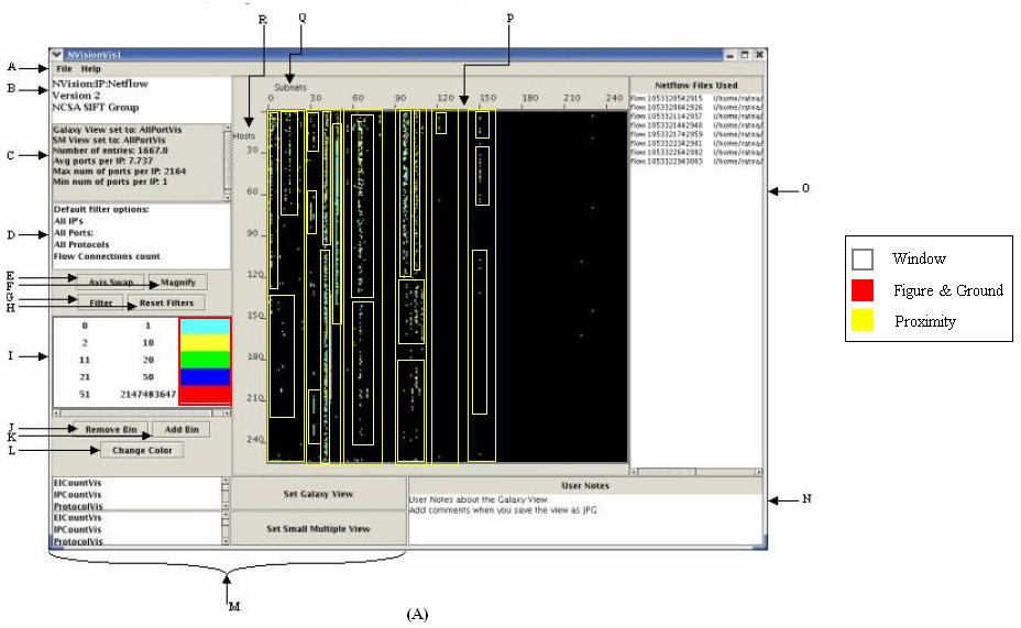
124 111

125 112 Figure 33: High-Level view NVisionIP evaluation result. (A) Evaluated visualization scene. (B) Complexity tree build for (A). (C) The original evaluating visualization scene. The complexity tree suggests the visual search task performed against this visualization does not require memory load exhaustion. There are six main pieces of clusters that users need to compare and process at the same time. The further clusters for each higher level grouping do not exceed the magic number seven rule.
126 Mid-Level Detail View: There are two windows present in the SMV visualization screen shot. Similar to the previous color key window, it does not need further decomposition. In the SMV, users can scroll down to see more SMV windows in this visualization scene. However, to evaluate the efficiency of visual search, we only need to consider the SMV windows present at one time. We first cluster the visualization into windows presented in the visualization using the closure theory in Gestalt law. Within each SMV, we can further decompose the window into two bar graph use similarity theory. A complexity tree is built for the visualization and presented in Figure 34(b). Compare this complexity tree with the previous high-level visualization complexity tree. We can clearly see that this visualization requires much more memory load capacity to process the scene. Furthermore, the number of clusters exceeds the suggested critical number. Therefore, the efficiency of visual search in this visualization might be low.
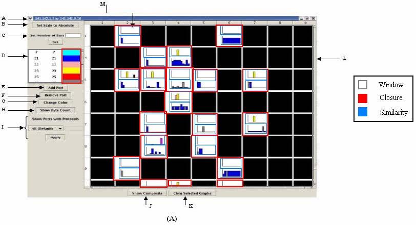
127 114

128 115 Figure 34: Mid Level view NVisionIP evaluation result. (A) Evaluated visualization scene. (B) Complexity tree built for (A). (C) The original visualization scene Low-Level Feature View: The machine view consists of six bar graphs. The visualization is simple and does not require much decomposition. We decompose the scene into six sub-graphics using the symmetry rule from Gestalt Law. The visualization does not require more than one time decomposition and

129 116 we can go ahead build a complexity tree from the six sub-graphics. The complexity tree is simple and does not have any relational node.
 A complexity tree built for (A). (C) The original visualization scene. 4.1.4. Evaluation Metrics")
130 117 Figure 35: Low Level view NVisionIP evaluation results. (A) Evaluated visualization scene. (B) A complexity tree built for (A). (C) The original visualization scene Evaluation Metrics
131 118 Table 4: Evaluation results in metrics format for NVisionIP. Visualizati Security Relational Complexity Visual Search Guidance Number of on Architecture chunking segmenta Color Moti Size Orien Data Points tion on (pix 2 ) tation NVisionIP High level n/a Mid level n/a n/a Low level n/a n/a An evaluation metric is built based on the three complexity trees built for each architecture level of NVisionIP. In the publication, the number of data points is not stated. Therefore, two cells in the number of data points column do not have appropriate values. From the statistics shown in table 4, we observe the following points: In NVisionIP, the mid-level SMV view is the most complex visualization scene among the three topologies based on its notable chunking number, 38. The outstanding chunking number can be explained as the visualization design put a lot of weight in its mid-level view. According to the statistics, users may spend a lot of time analysing data in the mid-level view.
132 119 The sequential sub-steps require completing a visual search for each view are evenly distributed. This means, if the memory capacity loads required by each view are close, then the user can accomplish a visual search in a predictable time. Among the three views of visualization, the galaxy view does the best job of guiding users attention to complete the search using the color attribute. Among the three views of visualization, the SMV view uses up the most space. The low size ratio indicates the visualization is not designed to use size as a guide to ead users through the visualization Evaluating VisFlowConnect VisFlowConnect is a network traffic visualization tool that allows users to do security analysis of large and complex networks ( VisFlowConnect is part of SIFT project in UIUC. Similar to other popular security visualization tool design, VisFlowConnect adopted the drill-down three-tier view. In VisFlowConeect, they are called global view, domain view, and internal view. In global view, a parallel visualization with three axis, sender, receiver domain, and internal host, is used to show the network flow. From the global view, users can zoom into the domain view that displays traffic data between specific external domain and the local network. For a further detail view, users can go to the internal view to see a visualization display of traffic data between internal domains and the local network. A program is
133 120 not available for VisFlowConnect. We evaluated this tool from screen shots from VisFlowConnect's official website ( High-Level Overview: There is one graphic scene in the global view visualization that needs to be evaluated. The global view is filled with lines connecting three different axis. We first group the graphics into two clusters using symmetry theory in Gestalt Law. Then, the clusters are further decomposed into relational nodes using proximity and continuity theories in Gestalt Law. A complexity tree is built for the global view visualization presented in Figure 36(b). The height and the width of the tree suggest this is a complex visualization scene. The memory capacity load is exhausted when used to perform visual search in this visualization.
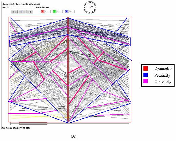
134 121

135 122 Figure 36: High-level view VisFlowConnect evaluation result (A) Evaluated visualization scene. (B) Complexity tree built for (A). (C) Original evaluation visualization scene Mid-Level Detail View: The domain view visualization has lines connecting two axes. To evaluate this visualization scene, we first cluster the visualization into solid color space and background by use

136 123 figure and ground in Gestalt Law. We further decompose the visualization into smaller chunks by continuity. A complexity tree is built for the visualization and presented in Figure 37(b). Compare the complexity tree built for domain view and global view. It is clear the memory load needed to process the domain view visualization is less than what is needed for global view visualization. From the visualization scene, we can see the domain view visualization has less noise provided by lines and has much more of a focus point in the visualization.
137 124

138 125 Figure 37: Mid-level view VisFlowConnect evaluation result (A) Evaluated visualization scene. (B) A complexity tree built for (A). (C) The original visualization scene Low-Level Feature View: For the internal view visualization, we first cluster the graphics into two pieces using the symmetry rule. Then we further decompose the visualization scene using the continuity rule.
139 126 The internal view visualization has cleaner graphics compare to the domain view visualization, but the evaluation result for conceptual chunking yields favor for domain view visualization. The reason for this is because in domain view visualization, there is a strong presence of solid space and background noise, but internal view visualization does not. Instead, in internal view, there are lines cutting through graphics and dividing up the space.
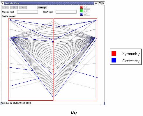
140 127
 A complexity tree built for (A). (C) The original visualization scene. 4.2.4. Evaluation Metrics")
141 128 Figure 38: Low-level view VisFlowConnect evaluation result (A) Evaluated visualization scene. (B) A complexity tree built for (A). (C) The original visualization scene Evaluation Metrics
142 129 Table 5: Evaluation results in metrics format for VisFlowConnect. Visualiza tion VisFlow Connect Security Architect Relational Complexity Visual Search Guidance Number of Data ure chunking segmen Color Motio Size Orien Points tation n (pix 2 ) tation High n/a n/a level 956 Mid level n/a n/a 943 Low level n/a n/a 313 There are no dataset statistics to come with the screen shots. Unfortunately, we are not able to state the number of data points used for each screen shots. From the statistics provided in table 5, we observe the following points: Among the tree visualization views, the high-level view of visualization requires the most memory capacity load and sequential steps to complete the visual search task. The chunking number for global view visualization is more than twice as high as the other two views. It suggests that the visualization is designed to put too much memory load usage on the global view.
143 130 There is a decreasing fashion of contrasting color usage once the user drills down from overview to feature view. The target-distractor size ratio for VisFlowConnect is higher than NVisionIP s. Earlier in the thesis we discuss the that higher size ratio means the visualization uses target and distrator size differences to highlight features of the visualization. In this particular visualization, the busyness of the lines leads users attention away from any focus point in the visualization. This may indicate that the target-distractor ratios can mean different things when we deal with different type of visualization Evaluating RUMINT RUMINT is a security visualization system developed by Gregory Conti ( RUMINT is constructed by a main control program and seven visualization components. RUMINT sets itself apart from other visualization tool by allowing users the choice to use different visualization components interchangeably. In high level overview, the tool provides thumbnail display. In mid-level view, the tool provides a choice between parallel coordinate, glyph based animation display, and scatter plot to explore the dataset in more detail. In low-level view, the tool provides choices between scrolling text display, packet detail rainfall display, and byte frequency display. To evaluate RUMINT using complexity evaluation method, we built a complexity tree describing the critical complexity of the system for each level. The

")
144 131 PCAP dataset used to explore the tool is provided by the author, Gregory Conti, and contains 1797 data points. The evaluated results are presented as following: High-Level Overview: Figure 39: High-level view RUMINT evaluation result (A) Evaluated visualization. (B) Complexity tree build for (A).
145 132 There are only four windows that need to be considered for further review from this level. Therefore, only four window nodes are included. Furthermore, the window itself does not need further decomposition, so entity nodes are immediately followed by the window nodes Mid-Level Detail View:
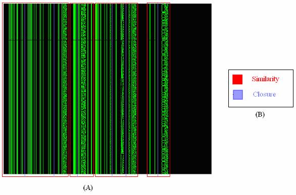

146 133
147 134 Figure 40: Mid-level view RUMINT evaluation result (A) The evaluated visualization scene. (B) The relational complexity decomposing key. The visualization is grouped by different color. Each color represents a gestalt law. (C) The original visualization scene without group marking. (D) The complexity tree builds for (A). For mid-level view, the user has the choice to view between parallel coordinate, glyph animation, binary rainfall, and scatter plot. After our investigation, we found that binary rainfall is the most complex visual scene in which to conduct a visual search. Therefore, we chose the binary rainfall as the evaluating scene.
148 Low-Level Feature View: 135
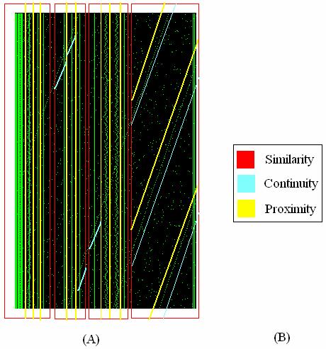
149 136
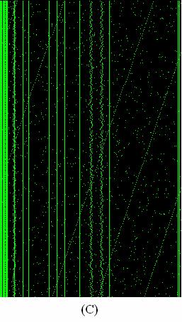
150 137
PLANNING THE RESEARCH PROJECT
 Van Der Velde / Guide to Business Research Methods First Proof 6.11.2003 4:53pm page 1 Part I PLANNING THE RESEARCH PROJECT Van Der Velde / Guide to Business Research Methods First Proof 6.11.2003 4:53pm
Understanding Users. - cognitive processes. Unit 3
 Understanding Users - cognitive processes Unit 3 Why do we need to understand users? Interacting with technology involves a number of cognitive processes We need to take into account Characteristic & limitations
Getting the Design Right Daniel Luna, Mackenzie Miller, Saloni Parikh, Ben Tebbs
 Meet the Team Getting the Design Right Daniel Luna, Mackenzie Miller, Saloni Parikh, Ben Tebbs Mackenzie Miller: Project Manager Daniel Luna: Research Coordinator Saloni Parikh: User Interface Designer
Animated Scatterplot Analysis of Time- Oriented Data of Diabetes Patients
 Animated Scatterplot Analysis of Time- Oriented Data of Diabetes Patients First AUTHOR a,1, Second AUTHOR b and Third Author b ; (Blinded review process please leave this part as it is; authors names will
Information Design. Information Design
 Information Design Goal: identify methods for representing and arranging the objects and actions possible in a system in a way that facilitates perception and understanding Information Design Define and
1. INTRODUCTION. Vision based Multi-feature HGR Algorithms for HCI using ISL Page 1
 1. INTRODUCTION Sign language interpretation is one of the HCI applications where hand gesture plays important role for communication. This chapter discusses sign language interpretation system with present
Controlled Experiments
 CHARM Choosing Human-Computer Interaction (HCI) Appropriate Research Methods Controlled Experiments Liz Atwater Department of Psychology Human Factors/Applied Cognition George Mason University lizatwater@hotmail.com
Chapter 02 Developing and Evaluating Theories of Behavior
 Chapter 02 Developing and Evaluating Theories of Behavior Multiple Choice Questions 1. A theory is a(n): A. plausible or scientifically acceptable, well-substantiated explanation of some aspect of the
Quantitative Evaluation
 Quantitative Evaluation Research Questions Quantitative Data Controlled Studies Experimental Methods Role of Statistics Quantitative Evaluation What is experimental design? What is an experimental hypothesis?
6. A theory that has been substantially verified is sometimes called a a. law. b. model.
 Chapter 2 Multiple Choice Questions 1. A theory is a(n) a. a plausible or scientifically acceptable, well-substantiated explanation of some aspect of the natural world. b. a well-substantiated explanation
Visual Design. Simplicity, Gestalt Principles, Organization/Structure
 Visual Design Simplicity, Gestalt Principles, Organization/Structure Many examples are from Universal Principles of Design, Lidwell, Holden, and Butler 1 Why discuss visual design? You need to present
Course summary, final remarks
 Course "Empirical Evaluation in Informatics" Prof. Dr. Lutz Prechelt Freie Universität Berlin, Institut für Informatik http://www.inf.fu-berlin.de/inst/ag-se/ Role of empiricism Generic method Concrete
Chapter 4 Research Methodology
 Chapter 4 Research Methodology 137 RESEARCH METHODOLOGY Research Gap Having done a thorough literature review on gender diversity practices in IT organisations, it has been observed that there exists a
The Regression-Discontinuity Design
 Page 1 of 10 Home» Design» Quasi-Experimental Design» The Regression-Discontinuity Design The regression-discontinuity design. What a terrible name! In everyday language both parts of the term have connotations
Z-Glyph: Visualizing outliers in multivariate data
 Original Article Z-Glyph: Visualizing outliers in multivariate data Information Visualization 1 19 Ó The Author(s) 2017 Reprints and permissions: sagepub.co.uk/journalspermissions.nav DOI: 10.1177/1473871616686635
Who? What? What do you want to know? What scope of the product will you evaluate?
 Usability Evaluation Why? Organizational perspective: To make a better product Is it usable and useful? Does it improve productivity? Reduce development and support costs Designer & developer perspective:
Experimental Research in HCI. Alma Leora Culén University of Oslo, Department of Informatics, Design
 Experimental Research in HCI Alma Leora Culén University of Oslo, Department of Informatics, Design almira@ifi.uio.no INF2260/4060 1 Oslo, 15/09/16 Review Method Methodology Research methods are simply
Framework for Comparative Research on Relational Information Displays
 Framework for Comparative Research on Relational Information Displays Sung Park and Richard Catrambone 2 School of Psychology & Graphics, Visualization, and Usability Center (GVU) Georgia Institute of
COGS 121 HCI Programming Studio. Week 03
 COGS 121 HCI Programming Studio Week 03 Direct Manipulation Principles of Direct Manipulation 1. Continuous representations of the objects and actions of interest with meaningful visual metaphors. 2. Physical
University of Toronto. Final Report. myacl. Student: Alaa Abdulaal Pirave Eahalaivan Nirtal Shah. Professor: Jonathan Rose
 University of Toronto Final Report myacl Student: Alaa Abdulaal Pirave Eahalaivan Nirtal Shah Professor: Jonathan Rose April 8, 2015 Contents 1 Goal & Motivation 2 1.1 Background..............................................
EMPIRICAL RESEARCH METHODS IN VISUALIZATION
 EMPIRICAL RESEARCH METHODS IN VISUALIZATION and some thoughts on their role in Master, PHD and postdoctoral projects Talk at University of Sydney, 11. August 2014 Stephan Diehl University of Trier / Universität
Visual Perception. Agenda. Visual perception. CS Information Visualization January 20, 2011 John Stasko. Pre-attentive processing Color Etc.
 Topic Notes Visual Perception CS 7450 - Information Visualization January 20, 2011 John Stasko Agenda Visual perception Pre-attentive processing Color Etc. Spring 2011 CS 7450 2 1 Semiotics The study of
Today s Agenda. Human abilities Cognition Review for Exam1
 Today s Agenda Human abilities Cognition Review for Exam1 Announcement Exam 1 is scheduled Monday, Oct. 1 st, in class Cover materials until Sep. 24 Most of materials from class lecture notes You are allowed
VISUAL PERCEPTION & COGNITIVE PROCESSES
 VISUAL PERCEPTION & COGNITIVE PROCESSES Prof. Rahul C. Basole CS4460 > March 31, 2016 How Are Graphics Used? Larkin & Simon (1987) investigated usefulness of graphical displays Graphical visualization
Development of Attractiveness Walkthrough
 Development of Attractiveness Walkthrough Aliaksei Miniukovich University of Trento, Trento, Italy miniukovich@disi.unitn.it Abstract. In this paper, I describe the development of Attractiveness Walkthrough
Answers to end of chapter questions
 Answers to end of chapter questions Chapter 1 What are the three most important characteristics of QCA as a method of data analysis? QCA is (1) systematic, (2) flexible, and (3) it reduces data. What are
Examples of Feedback Comments: How to use them to improve your report writing. Example 1: Compare and contrast
 Examples of Feedback Comments: How to use them to improve your report writing This document contains 4 examples of writing and feedback comments from Level 2A lab reports, and 4 steps to help you apply
Measuring the User Experience
 Measuring the User Experience Collecting, Analyzing, and Presenting Usability Metrics Chapter 2 Background Tom Tullis and Bill Albert Morgan Kaufmann, 2008 ISBN 978-0123735584 Introduction Purpose Provide
High-level Vision. Bernd Neumann Slides for the course in WS 2004/05. Faculty of Informatics Hamburg University Germany
 High-level Vision Bernd Neumann Slides for the course in WS 2004/05 Faculty of Informatics Hamburg University Germany neumann@informatik.uni-hamburg.de http://kogs-www.informatik.uni-hamburg.de 1 Contents
Audio: In this lecture we are going to address psychology as a science. Slide #2
 Psychology 312: Lecture 2 Psychology as a Science Slide #1 Psychology As A Science In this lecture we are going to address psychology as a science. Slide #2 Outline Psychology is an empirical science.
CSC2524 L0101 TOPICS IN INTERACTIVE COMPUTING: INFORMATION VISUALISATION VISUAL PERCEPTION. Fanny CHEVALIER
 CSC2524 L0101 TOPICS IN INTERACTIVE COMPUTING: INFORMATION VISUALISATION VISUAL PERCEPTION Fanny CHEVALIER VISUAL PERCEPTION & COGNITION KNOWING HOW WE PERCEIVE TO BETTER REPRESENT [Source: http://www.creativebloq.com/design/science-behind-data-visualisation-8135496]
CHAPTER 3. Methodology
 CHAPTER 3 Methodology The purpose of this chapter is to provide the research methodology which was designed to achieve the objectives of this study. It is important to select appropriate method to ensure
Statistical analysis DIANA SAPLACAN 2017 * SLIDES ADAPTED BASED ON LECTURE NOTES BY ALMA LEORA CULEN
 Statistical analysis DIANA SAPLACAN 2017 * SLIDES ADAPTED BASED ON LECTURE NOTES BY ALMA LEORA CULEN Vs. 2 Background 3 There are different types of research methods to study behaviour: Descriptive: observations,
LEARNING. Learning. Type of Learning Experiences Related Factors
 LEARNING DEFINITION: Learning can be defined as any relatively permanent change in behavior or modification in behavior or behavior potentials that occur as a result of practice or experience. According
Fundamental Concepts for Using Diagnostic Classification Models. Section #2 NCME 2016 Training Session. NCME 2016 Training Session: Section 2
 Fundamental Concepts for Using Diagnostic Classification Models Section #2 NCME 2016 Training Session NCME 2016 Training Session: Section 2 Lecture Overview Nature of attributes What s in a name? Grain
Incorporation of Imaging-Based Functional Assessment Procedures into the DICOM Standard Draft version 0.1 7/27/2011
 Incorporation of Imaging-Based Functional Assessment Procedures into the DICOM Standard Draft version 0.1 7/27/2011 I. Purpose Drawing from the profile development of the QIBA-fMRI Technical Committee,
Critical Thinking Assessment at MCC. How are we doing?
 Critical Thinking Assessment at MCC How are we doing? Prepared by Maura McCool, M.S. Office of Research, Evaluation and Assessment Metropolitan Community Colleges Fall 2003 1 General Education Assessment
THE DYNAMICS OF MOTIVATION
 92 THE DYNAMICS OF MOTIVATION 1. Motivation is a highly dynamic construct that is constantly changing in reaction to life experiences. 2. Needs and goals are constantly growing and changing. 3. As individuals
MN 400: Research Methods. PART II The Design of Research
 MN 400: Research Methods PART II The Design of Research 1 MN 400: Research Methods CHAPTER 6 Research Design 2 What is Research Design? A plan for selecting the sources and types of information used to
Sensation & Perception PSYC420 Thomas E. Van Cantfort, Ph.D.
 Sensation & Perception PSYC420 Thomas E. Van Cantfort, Ph.D. Objects & Forms When we look out into the world we are able to see things as trees, cars, people, books, etc. A wide variety of objects and
ADAPTING COPYCAT TO CONTEXT-DEPENDENT VISUAL OBJECT RECOGNITION
 ADAPTING COPYCAT TO CONTEXT-DEPENDENT VISUAL OBJECT RECOGNITION SCOTT BOLLAND Department of Computer Science and Electrical Engineering The University of Queensland Brisbane, Queensland 4072 Australia
Support for Cognitive Science Experiments
 Support for Cognitive Science Experiments CogSketch as Research Instrument Corpus of stimuli for people Corpus of formally represented stimuli Cognitive Simulation Compare results on variety of tasks Gathering
Principals of Object Perception
 Principals of Object Perception Elizabeth S. Spelke COGNITIVE SCIENCE 14, 29-56 (1990) Cornell University Summary Infants perceive object by analyzing tree-dimensional surface arrangements and motions.
(Visual) Attention. October 3, PSY Visual Attention 1
 Attention. October 3, PSY Visual Attention 1") (Visual) Attention Perception and awareness of a visual object seems to involve attending to the object. Do we have to attend to an object to perceive it? Some tasks seem to proceed with little or no attention
(Visual) Attention Perception and awareness of a visual object seems to involve attending to the object. Do we have to attend to an object to perceive it? Some tasks seem to proceed with little or no attention
Copyright is owned by the Author of the thesis. Permission is given for a copy to be downloaded by an individual for the purpose of research and
 Copyright is owned by the Author of the thesis. Permission is given for a copy to be downloaded by an individual for the purpose of research and private study only. The thesis may not be reproduced elsewhere
Application of ecological interface design to driver support systems
 Application of ecological interface design to driver support systems J.D. Lee, J.D. Hoffman, H.A. Stoner, B.D. Seppelt, and M.D. Brown Department of Mechanical and Industrial Engineering, University of
Ultrasonic Phased Array Inspection of Turbine Components
 ECNDT 2006 - Th.2.6.2 Ultrasonic Phased Array Inspection of Turbine Components Waheed A. ABBASI, Michael F. FAIR, SIEMENS Power Generation, Pittsburgh, USA Abstract. The advent and proliferation of Ultrasonic
OECD QSAR Toolbox v.4.2. An example illustrating RAAF scenario 6 and related assessment elements
 OECD QSAR Toolbox v.4.2 An example illustrating RAAF scenario 6 and related assessment elements Outlook Background Objectives Specific Aims Read Across Assessment Framework (RAAF) The exercise Workflow
Inventory Research agenda setting
 The health research system is responsible for generating knowledge through scientific inquiry focusing on people s health and well being. Health research spans the entire range from (bio)medical research,
360 Degree Feedback Assignment. Robert M. Clarkson. Virginia Commonwealth University. EDLP 703 Understanding Self as Leader: Practical Applications
 Running head: 360 DEGREE FEEDBACK 1 360 Degree Feedback Assignment Robert M. Clarkson Virginia Commonwealth University EDLP 703 Understanding Self as Leader: Practical Applications Commented [O1]: All
Convergence Principles: Information in the Answer
 Convergence Principles: Information in the Answer Sets of Some Multiple-Choice Intelligence Tests A. P. White and J. E. Zammarelli University of Durham It is hypothesized that some common multiplechoice
Psychology 205, Revelle, Fall 2014 Research Methods in Psychology Mid-Term. Name:
 Name: 1. (2 points) What is the primary advantage of using the median instead of the mean as a measure of central tendency? It is less affected by outliers. 2. (2 points) Why is counterbalancing important
What Case Study means? Case Studies. Case Study in SE. Key Characteristics. Flexibility of Case Studies. Sources of Evidence
 DCC / ICEx / UFMG What Case Study means? Case Studies Eduardo Figueiredo http://www.dcc.ufmg.br/~figueiredo The term case study frequently appears in title and abstracts of papers Its meaning varies a
Enumerative and Analytic Studies. Description versus prediction
 Quality Digest, July 9, 2018 Manuscript 334 Description versus prediction The ultimate purpose for collecting data is to take action. In some cases the action taken will depend upon a description of what
Natural Scene Statistics and Perception. W.S. Geisler
 Natural Scene Statistics and Perception W.S. Geisler Some Important Visual Tasks Identification of objects and materials Navigation through the environment Estimation of motion trajectories and speeds
AC : USABILITY EVALUATION OF A PROBLEM SOLVING ENVIRONMENT FOR AUTOMATED SYSTEM INTEGRATION EDUCA- TION USING EYE-TRACKING
 AC 2012-4422: USABILITY EVALUATION OF A PROBLEM SOLVING ENVIRONMENT FOR AUTOMATED SYSTEM INTEGRATION EDUCA- TION USING EYE-TRACKING Punit Deotale, Texas A&M University Dr. Sheng-Jen Tony Hsieh, Texas A&M
Smart NDT Tools: A New Generation of NDT Devices
 ECNDT 2006 - Th.2.1.2 Smart NDT Tools: A New Generation of NDT Devices Sébastien ROLET, EADS Corporate Research Center, Colomiers, France Abstract. EADS CRC is designing specific NDT solutions for EADS
Visual Perception. Agenda. Visual perception. CS Information Visualization August 26, 2013 John Stasko. Pre-attentive processing Color Etc.
 Topic Notes Visual Perception CS 7450 - Information Visualization August 26, 2013 John Stasko Agenda Visual perception Pre-attentive processing Color Etc. Fall 2013 CS 7450 2 1 Semiotics The study of symbols
Requirement Error Abstraction and Classification: A Control Group Replicated Study
 18th IEEE International Symposium on Software Reliability Engineering Requirement Error Abstraction and Classification: A Control Group Replicated Study Gursimran S. Walia, Jeffrey C. Carver, and Thomas
Review of Veterinary Epidemiologic Research by Dohoo, Martin, and Stryhn
 The Stata Journal (2004) 4, Number 1, pp. 89 92 Review of Veterinary Epidemiologic Research by Dohoo, Martin, and Stryhn Laurent Audigé AO Foundation laurent.audige@aofoundation.org Abstract. The new book
Pushing the Right Buttons: Design Characteristics of Touch Screen Buttons
 1 of 6 10/3/2009 9:40 PM October 2009, Vol. 11 Issue 2 Volume 11 Issue 2 Past Issues A-Z List Usability News is a free web newsletter that is produced by the Software Usability Research Laboratory (SURL)
Implementing Lean Six Sigma in Organizations. Dhr. B.A. Lameijer
 Implementing Lean Six Sigma in Organizations. Dhr. B.A. Lameijer Summary of implementing LSS in organizations Due to a variety of reasons such as increased competition, resource scarcity and transparency
Designing a Web Page Considering the Interaction Characteristics of the Hard-of-Hearing
 Designing a Web Page Considering the Interaction Characteristics of the Hard-of-Hearing Miki Namatame 1,TomoyukiNishioka 1, and Muneo Kitajima 2 1 Tsukuba University of Technology, 4-3-15 Amakubo Tsukuba
Effect of Visuo-Spatial Working Memory on Distance Estimation in Map Learning
 GSTF Journal of Psychology (JPsych) Vol. No., August 5 Effect of Visuo-Spatial Working Memory on Distance Estimation in Map Learning Hironori Oto 79 Received 6 Jul 5 Accepted 9 Aug 5 Abstract This paper
Getting the Payoff With MDD. Proven Steps to Get Your Return on Investment
 Getting the Payoff With MDD Proven Steps to Get Your Return on Investment version 1.4 6/18/11 Generate Results: Real Models, Real Code, Real Fast. www.pathfindersolns.com Welcome Systems development organizations
Empirical Research Methods for Human-Computer Interaction. I. Scott MacKenzie Steven J. Castellucci
 Empirical Research Methods for Human-Computer Interaction I. Scott MacKenzie Steven J. Castellucci 1 Topics The what, why, and how of empirical research Group participation in a real experiment Observations
Lecturer: Dr. Emmanuel Adjei Department of Information Studies Contact Information:
 Lecturer: Dr. Emmanuel Adjei Department of Information Studies Contact Information: eadjei@ug.edu.gh College of Education School of Continuing and Distance Education 2014/2015 2016/2017 Session Overview
Agents with Attitude: Exploring Coombs Unfolding Technique with Agent-Based Models
 Int J Comput Math Learning (2009) 14:51 60 DOI 10.1007/s10758-008-9142-6 COMPUTER MATH SNAPHSHOTS - COLUMN EDITOR: URI WILENSKY* Agents with Attitude: Exploring Coombs Unfolding Technique with Agent-Based
Active Deformable Part Models Inference
 Active Deformable Part Models Inference Menglong Zhu Nikolay Atanasov George J. Pappas Kostas Daniilidis GRASP Laboratory, University of Pennsylvania 3330 Walnut Street, Philadelphia, PA 19104, USA Abstract.
Visualization Research and the Human Mind
 Visualization Research and the Human Mind Ronald A. Rensink Departments of Psychology and Computer Science University of British Columbia Vancouver, Canada IEEE VIS 2016, Baltimore, MD How can empirical
Personality Traits Effects on Job Satisfaction: The Role of Goal Commitment
 Marshall University Marshall Digital Scholar Management Faculty Research Management, Marketing and MIS Fall 11-14-2009 Personality Traits Effects on Job Satisfaction: The Role of Goal Commitment Wai Kwan
How Doctors Feel About Electronic Health Records. National Physician Poll by The Harris Poll
 How Doctors Feel About Electronic Health Records National Physician Poll by The Harris Poll 1 Background, Objectives, and Methodology New research from Stanford Medicine, conducted with The Harris Poll
Left Handed Split Brain. Learning Objectives Topics
 Left Handed Split Brain Case study V.J.: Gazzaniga, 1998 Left handed split brain patient Spoke out of left hemisphere Wrote out of right hemisphere Writing = independent from language systems Frey et al.
Development of Concept of Transitivity in Pre-Operational Stage Children
 Development of Concept of Transitivity in Pre-Operational Stage Children Chaitanya Ahuja Electrical Engineering Pranjal Gupta Civil Engineering Metored by: Dr. Amitabha Mukherjee Department of Computer
Local Image Structures and Optic Flow Estimation
 Local Image Structures and Optic Flow Estimation Sinan KALKAN 1, Dirk Calow 2, Florentin Wörgötter 1, Markus Lappe 2 and Norbert Krüger 3 1 Computational Neuroscience, Uni. of Stirling, Scotland; {sinan,worgott}@cn.stir.ac.uk
Self-Handicapping Variables and Students' Performance
 Georgia Southern University Digital Commons@Georgia Southern SoTL Commons Conference SoTL Commons Conference Mar 12th, 4:00 PM - 5:45 PM Self-Handicapping Variables and Students' Performance Lugenia Dixon
Robot Learning Letter of Intent
 Research Proposal: Robot Learning Letter of Intent BY ERIK BILLING billing@cs.umu.se 2006-04-11 SUMMARY The proposed project s aim is to further develop the learning aspects in Behavior Based Control (BBC)
Alternative Explanations for Changes in Similarity Judgments and MDS Structure
 Cornell University School of Hotel Administration The Scholarly Commons Articles and Chapters School of Hotel Administration Collection 8-1990 Alternative Explanations for Changes in Similarity Judgments
Tutorial: RNA-Seq Analysis Part II: Non-Specific Matches and Expression Measures
 : RNA-Seq Analysis Part II: Non-Specific Matches and Expression Measures March 15, 2013 CLC bio Finlandsgade 10-12 8200 Aarhus N Denmark Telephone: +45 70 22 55 09 Fax: +45 70 22 55 19 www.clcbio.com support@clcbio.com
Visualizing Sports Injuries in Athletes
 Visualizing Sports Injuries in Athletes Arlene Swan College of Information Science and Technology, Drexel University The ischool, Distance Learning Program INFO633: Information Visualization Professor
Fundamentals of Psychophysics
 Fundamentals of Psychophysics John Greenwood Department of Experimental Psychology!! NEUR3045! Contact: john.greenwood@ucl.ac.uk 1 Visual neuroscience physiology stimulus How do we see the world? neuroimaging
5. is the process of moving from the specific to the general. a. Deduction
 Applied Social Psychology Understanding and Addressing Social and Practical Problems 3rd Edition Gruman Test Bank Full Download: https://testbanklive.com/download/applied-social-psychology-understanding-and-addressing-social-and-practical-p
CHAPTER 3 METHOD AND PROCEDURE
 CHAPTER 3 METHOD AND PROCEDURE Previous chapter namely Review of the Literature was concerned with the review of the research studies conducted in the field of teacher education, with special reference
Assessing Modes of Interaction
 Project 2 Assessing Modes of Interaction Analysis of exercise equipment Overview For this assignment, we conducted a preliminary analysis of two similar types of elliptical trainers. We are able to find
A Case Study: Two-sample categorical data
 A Case Study: Two-sample categorical data Patrick Breheny January 31 Patrick Breheny BST 701: Bayesian Modeling in Biostatistics 1/43 Introduction Model specification Continuous vs. mixture priors Choice
Position Paper: How Certain is Recommended Trust-Information?
 Position Paper: How Certain is Recommended Trust-Information? Uwe Roth University of Luxembourg FSTC Campus Kirchberg 6, rue Richard Coudenhove-Kalergi L-1359 Luxembourg uwe.roth@uni.lu ABSTRACT Nowadays
MULTIPLE LINEAR REGRESSION 24.1 INTRODUCTION AND OBJECTIVES OBJECTIVES
 24 MULTIPLE LINEAR REGRESSION 24.1 INTRODUCTION AND OBJECTIVES In the previous chapter, simple linear regression was used when you have one independent variable and one dependent variable. This chapter
Qualitative and Quantitative Approaches Workshop. Comm 151i San Jose State U Dr. T.M. Coopman Okay for non-commercial use with attribution
 Qualitative and Quantitative Approaches Workshop Comm 151i San Jose State U Dr. T.M. Coopman Okay for non-commercial use with attribution This Workshop This is a research skill workshop. This workshop
CS449/649: Human-Computer Interaction
 CS449/649: Human-Computer Winter 2018 Lecture XI Anastasia Kuzminykh Create Design Ideas Prototype Design Static representations of the product Sketches Wireframes Visualization Mockups Prototypes - interactive
Leveraging Data for Targeted Patient Population Health Improvements
 Leveraging Data for Targeted Patient Population Health Improvements Diabetes Impact on Health in America Diabetes is a major health concern in the United States today. The Centers for Disease Control
Selecting a research method
 Selecting a research method Tomi Männistö 13.10.2005 Overview Theme Maturity of research (on a particular topic) and its reflection on appropriate method Validity level of research evidence Part I Story
CHAPTER VI RESEARCH METHODOLOGY
 CHAPTER VI RESEARCH METHODOLOGY 6.1 Research Design Research is an organized, systematic, data based, critical, objective, scientific inquiry or investigation into a specific problem, undertaken with the
User Tasks & Analysis. CS Information Visualization October 3, 2016 John Stasko
 User Tasks & Analysis CS 7450 - Information Visualization October 3, 2016 John Stasko Learning Objectives Understand the importance of tasks, goals, and objectives for visualization Identify the common
What Makes a Good Cyber Operator?
 https://www.csiac.org/ What Makes a Good Cyber Operator? Today s Presenter: Robert Dora, Research Engineer Assured Information Security, Inc. (AIS) September 28, 2016 Moderator: Steve Warzala swarzala@quanterion.com
Why Human-Centered Design Matters
 Reading Review: Article Why Human-Centered Design Matters -Dave Thomsen, Wanderful Media HUMAN CENTERED DESIGN a human-centered approach fuels the creation of products that resonate more deeply with an
Citation for published version (APA): Weert, E. V. (2007). Cancer rehabilitation: effects and mechanisms s.n.
: Weert, E. V. (2007). Cancer rehabilitation: effects and mechanisms s.n.") University of Groningen Cancer rehabilitation Weert, Ellen van IMPORTANT NOTE: You are advised to consult the publisher's version (publisher's PDF) if you wish to cite from it. Please check the document
University of Groningen Cancer rehabilitation Weert, Ellen van IMPORTANT NOTE: You are advised to consult the publisher's version (publisher's PDF) if you wish to cite from it. Please check the document
Common Criteria. for. CGIAR Research Proposal (CRP) Design and Assessment
 Design and Assessment") Common Criteria for CGIAR Research Proposal (CRP) Design and Assessment 30 August 2010 1 CGIAR Research Proposals (CRPs) are reviewed at various stages of their development and approval. These assessments
Common Criteria for CGIAR Research Proposal (CRP) Design and Assessment 30 August 2010 1 CGIAR Research Proposals (CRPs) are reviewed at various stages of their development and approval. These assessments
NSERC, NSERC Aboriginal, Faculty of Science, Jack Prior and H.D Gesser Undergraduate Student Research Awards
 NSERC, NSERC Aboriginal, Faculty of Science, Jack Prior and H.D Gesser Undergraduate Student Research Awards DEADLINE: Friday, January 19, 2018 1st, 2nd, 3rd and 4th year Science undergraduate students..